A quick, critical look at the key ideas in the new UEC plan
[NB: updated with extra comments on June 8]The new NHS plan for improving emergency care is out.
It is a huge improvement over previous plans. I don’t often praise NHS plans especially on emergency care, but this one deserves at least some praise. But it is far from perfect and still has flaws carried forward from previous thinking.
Let’s look at the details.
What is better
It is far more honest than previous plans about the truly awful performance of the current UEC system. And finally admits that this performance is one of the critical factors that has cratered public trust in the NHS.
§12 begrudgingly admits that the the problem “...has only in part been fuelled by an
ageing population and an increase in multiple long-term conditions…”. This is better than previous plans that have often asserted that demand is the problem. But a clearer statement that demand isn’t the cause of the problem would have been welcome (and, §11 seems to vastly overstate the demand growth).
§13, §15 and §20 admit that coordination failures and “blame shunting” are part of the problem and should not be tolerated but overemphasises the blame shunting and coordination failures across organisations and under emphasises the significance of those failures inside providers which are probably more significant.
§23 stresses the critical importance of leadership. This is useful as getting hospital leaders aligned on the importance of A&E performance was one of the key factors that delivered the original 4hr target in the years to 2005 (when it was first met with a 98% standard). But, on the other hand, a great deal of NHS policy since 2010 has burdened and confused hospital leaders with a mountain of competing and often incompatible targets.
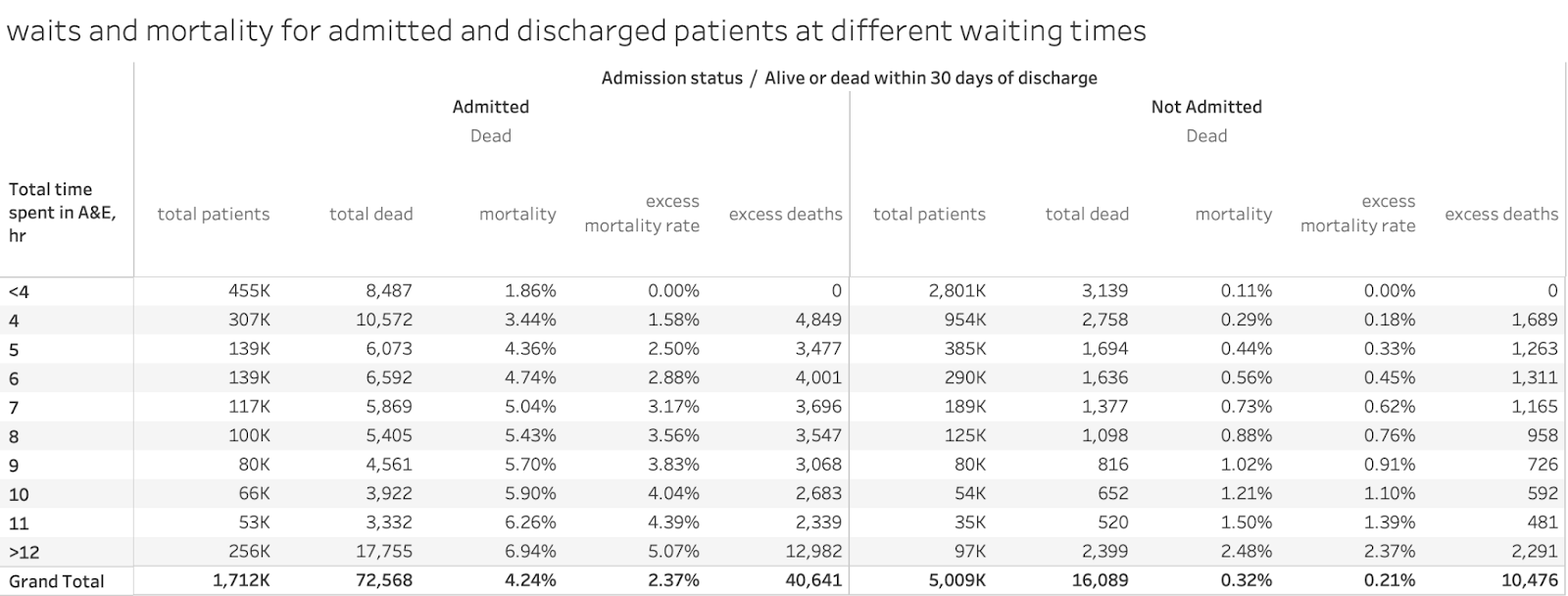
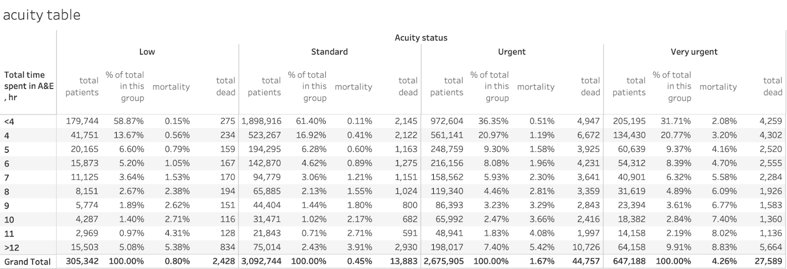
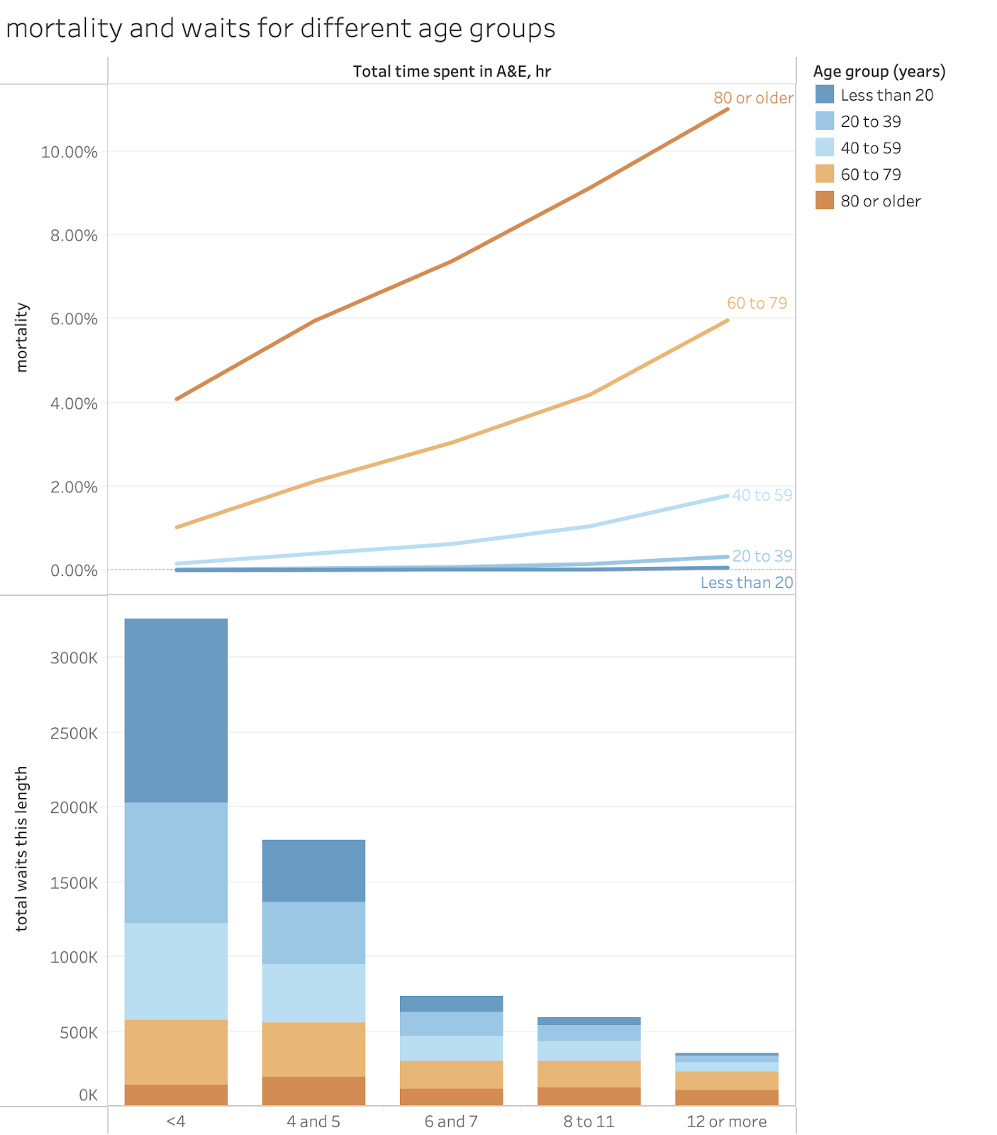
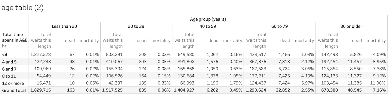
Perhaps the most important promise is in §21 which promises better, more transparent data on performance. The RCEM have long proposed publishing better site-level data and this should vastly improve transparency and reduce the opportunity for gaming by unbundling the major A&E sites from unrelated UTC sites. Publishing transparent 12hr wait performance will highlight the most harmful waits and minimise the incentive to game 4hr performance at the cost of worse 12hr performance. Having a target for 12hr waits has long been neglected in previous plans and is a vital first step in driving a reduction in the harm and mortality caused by long waits (while waits of 5-11hr also increase mortality, the 1.7m waits over 12hr (as the system has seen for three years in a row) see the highest mortality increase and reducing them first will yield the biggest benefits).
§74 to §79 promise some better focus on issues and interventions related to better performance management. That’s good. As is the emphasis on the importance for local leaders to be focussed on performance managing this problem.
What is still wrong
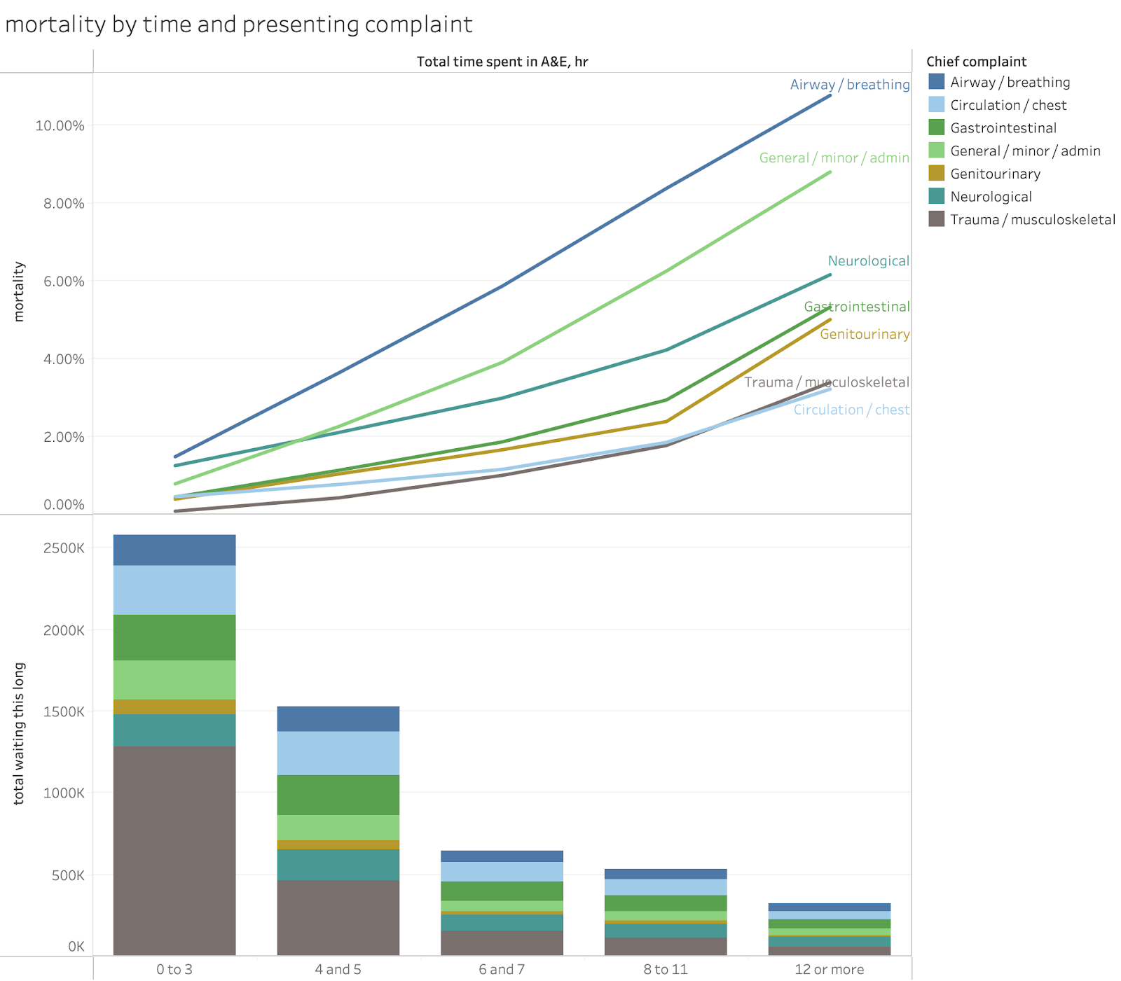
While this plan is considerably more focussed than the previous plans, it is still not very focussed. There are too many goals and some of them are not consistent. the dominant goal should be reducing waits in A&E: everything else should be about how to achieve shorter waits. Given the extraordinary mortality caused by long waits (see this blog) any other focus is distracting and harmful. And, since demand is not the primary cause of long waits, the space in the plan given to demand reduction initiatives is futile. Demand is not the problem.
The plan also fails to acknowledge the biggest and most compelling reason why reducing long A&E waits is vital: they kill patients. Mortality rises notably when waits are significantly longer than 4hr and the latest estimates of how many extra patients die from those long waits suggests that perhaps an extra 40k-60k annual deaths were being caused by them in 2022 when there were fewer than 950k 12hr waits. There have been more than 1.7m 12hr waits in each of the three years since then, suggesting excess deaths might exceed the mortality from covid, UK military deaths in WW2 or Russian battlefield deaths in Ukraine.
The plan is also somewhat confused about the difference between goals and metrics. It is also confused about the difference between fixing the root causes of the problem and improving the superficial symptoms of the problem. Long ambulance waits, for example, are caused by long delays inside A&Es and, if A&E is not fixed, there is little point in separately setting targets for ambulance handovers (unless there is strong evidence that specific failures in ambulance processes are adding extra delays which the plan does not provide).
§11 claims “Since 2010/11, the number accessing UEC services has risen by 90%”. I have no idea what they are counting here. Major (type 1) attendance is up less than 20% and even UTC attendance (type 3) is only up 45%. The performance problem is all in major A&Es and demand is not the problem there. Most UTCs do not have a performance problem and still meet the 95% 4hr target nationally.
While the idea of having a target to reduce 12hr waits is good there are two problems.
The first is that the target is unambitious. Reducing 12hr waits to under 10% of attendance is shockingly unambitious. We have had three years where moer than 1.7m people waited over 12hr (probably leading to 10k-12k unnecessary extra deaths). A target of eliminating 12hr waits in 2 years might have been better, if ambitious.
The second is that the 12hr target might have been more effective if it temporarily replaced the 4hr target. It should be a step towards improving A&E performance and eventually recovery of the 4hr standard, not a supplement to it (which leaves incentives to game 4hr performance in place.)
The plan chose to retain a 4hr target instead of temporarily replacing it with a 12hr focus. But the 4hr goal it sets is incredibly unambitious and confusing. It is confusing as it is still a "system" target which includes the performance of UTCs (type 3 units) who don't have problems. This encourages gaming of headline performance instead of a focus on the units where the problem is focussed, the major A&Es. The plan should have changed the metric to apply only to major A&Es (and if site level data is going to be published, major A&E sites not multi-site trusts). This change would make the 78% target far more ambitious. Current whole-system performance is in the mid 70-percent range. Current major A&E performance is averaging around 60%. The target should focus on where the improvement is needed.
§22 to §43 consist of two sections focussed on reducing demand. Some of the individual ideas are sensible (more flu vaccination is a generally good idea whether it reduces A&E demand or not). But, since demand is not the major cause of poor A&E performance, the volume of efforts to reduce it are mostly irrelevant to the problem at hand. I’m not saying don’t do the good things recommended in these sections. But I am saying that these things are a major distraction from fixing A&E performance and a focus on the handful of significant actions to achieve that would achieve more improvement.
The promised improvements in data transparency are very significant. But the section on digital investment (§69 to §73) is full of wishful thinking. I doubt that joined up care records can make much different to A&E or ambulance performance however many other benefits they have.
§72 is right to point out that “Rolling out the FDP is one thing: ensuring it is used effectively is another.” The point that implementation matters has rarely, if ever, been admitted in previous NHS strategies. But the belief that the Federated Data Platform is transformative is naive. As is the belief that better forecasting of A&E demand is useful. A&E demand has always been very predictable. The biggest operational problem is, and always has been, matching operational practices to the very-well-known demand patterns. The idea that better forecasting might help is pure snake oil (especially if AI based).
What is irrelevant and silly
The introduction to the plan claims in §1 that “the 10 Year Health Plan will set the
most transformative agenda we have seen in over 2 generations.” §16 places the same mistaken faith in the ten-year plan.
This is silly. The ten-year plan–at least what we have seen about its content–is absolutely not transformative. At best it is irrelevant to the current NHS crises; at worst its development has been a huge distraction from the need to tackle them. The NHS should not be placing any hope in the transformation it promises–it might have noble and useful ambitions–but it completely lacks the practical steps needed to deliver its promises. Moreover the goals of the ten-year plan won’t fix any of the problems causing poor A&E performance anyway.
And, while the promise of improved transparency on critical performance data is good, the idea that the major national digital programmes (like the FDP or the Connected Care Records Programme) will make big contributions is a fantasy. Offering a far bigger programme of training in operational improvement and management with better recruitment and training for analysts (all merely hinted at in §76) would be far more useful.
Conclusion
While the plan has some huge improvements over previous UEC plans, it still has too many distractions from the focus needed to tackle perhaps the biggest performance problem in the NHS. Improvement might happen faster with an even tighter focus on the handful of actions that would tackle the major bottlenecks to better performance and fewer distractions carried over from previous strategies that largely assumed the key problem was demand.