Pages

Showing posts with label dataviz. Show all posts

Sunday, 19 January 2025

Making sense of the new ONS estimates on A&E waiting times and mortality


Long waits in A&E kill patients. A new analysis of mortality and A&E waits by the ONS–despite issues in the analysis and presentation of the results–makes this look like an even bigger problem than previous analyses.


In January 2025 the Office of National Statistics (ONS) released a new analysis of the relationship between A&E waiting times and mortality. 


This is an important study because understanding when NHS performance is killing patients unnecessarily is a major indicator of where the system’s biggest and most important problems are.


But the results will be more contended and confusing than they needed to be because the ONS have presented them badly and have omitted some key data that make the importance of the results harder to judge and harder to compare with previous analysis.


This note is an attempt to explain the significance of the ONS results while also suggesting some of the improvements that could be made to make the results more useful.


The background to this analysis

The ONS are not the first to attempt to estimate the excess mortality caused by long waits. A previous analysis (of which I was a co-author) was published in 2022 in the Emergency Medical Journal and also used NHS patient-level data to derive reliable estimates of the relationship between long waits and mortality. 


This work was partly inspired by a previous Canadian study which also concluded that longer waits substantially increase mortality but with less reliable data on length of wait (the UK studies use data that contains the wait for individual patients).


The EMJ study, which has been extensively used in campaigns by the Royal College of Emergency Medicine (RCEM) to highlight the apocalyptic state of English A&E departments, used comprehensive data from april 2016 to march 2018 but only for admitted patients. Conservative estimates based on this study suggest that long waits cause between 10,000 and 20,000 extra deaths every year. The EMJ study did not estimate mortality for waits longer than 12hr due to the small numbers (which were below 2% of attendance in the period; they are over 10% now). The RCEM derived the excess deaths estimates using total published numbers for 12hr waits and the EMJ estimate of mortality for shorter waits of 8-12hr. Plus, recent estimates by the RCEM of excess deaths number were smaller than their original estimates as the EMJ data only covered admitted patients but recent NHS data says about one third of 12hr waits were discharged (an astounding statistic by itself) and the EMJ analysis did not estimate mortality for discharged patients.


It is notable that NHSE leadership’s response to the original publication was to dismiss the results. It is well worth reading the evidence session to the House of Commons Health Committee where Adrian Boyle of the RCEM presented the case and NHSE leaders dismissed it.


One argument too easily used to dismiss the importance of waiting times is that many other factors also influence mortality and some of them also increase waiting times, making describing the part of the excess mortality attributable just to long waits complex (though the EMJ paper went to great length to do adjustments and still concluded that waits were a big factor.


When rumours emerged that the ONS were doing an updated version of the analysis, there was some hope that it might swing the debate so the NHS would pay more attention to the problem. But the way the ONS chose to present their results blunted some of their possible impact as we shall see.


What the ONS did

The ONS created a cohort to analyse based on data from three datasets: the 2021 census (for demographic information); the ONS death registration data; and the complete NHS patient level data about all attendances to major (type 1) A&E departments for the financial year ending in march 2022.


The link to census data allows adjustments to expected death rates based on factors recorded in the census. The death registration data allows actual death rates to be analysed (the specific mortality metric is deaths within 30 days of hospital discharge). The A&E attendance data allows the analysis to cover all A&E attendances in the data. 


One important fact to note (in principle) is that this analysis is not based on sample data but on actual data. The total number of deaths is not an estimate but a count of actual deaths (so removing a major potential source of statistical uncertainty). This is also true of the EMJ analysis. There can be minor data quality issues because of poor data recording. For example, not all the patients in the A&E data can be matched to the other datasets (but this misses fewer than 5% of the total so should not be a big issue).


In short this should be a very high quality dataset leading to very reliable results.


In presenting the evidence the ONS chose to mostly present the adjusted data (so the mortality differences are adjusted to take account of multiple factors other than waiting times that also influence mortality). The EMJ paper also did this adjustment but using a completely different method.


Only one dataset in the ONS release does not adjust mortality for other factors. But they did not describe their adjustments in detail or how many patients were omitted from the final cohort totals (this will be a big issue as described later). This lack of detail does not mean their results are not notable or important but it does create some opportunities to cast doubt on the conclusions (many of which will be unfair or downright wrong but the ONS could have avoided the potential for criticism if they had provided more detail).


What were the key results?

I’m going to go through the key results and present many of them as charts which are a lot easier to understand than the raw tables released by the ONS. In the next section I will describe some of the issues that could have been avoided if the ONS had released additional data they must have to have been able to derive the analysis they have done.


The first chart here presents the raw data in the cohort they used for analysis:
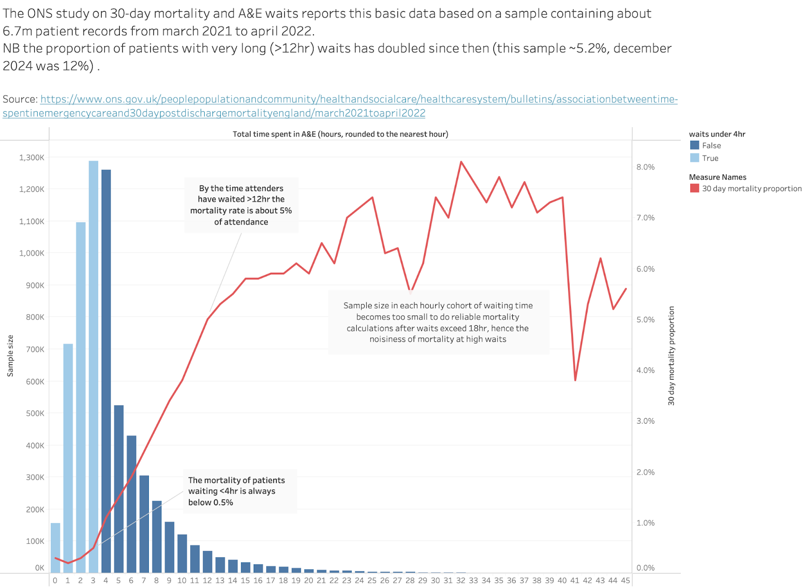


The bar chart shows the total number of patients who waited different amounts of time to leave the A&E. The data counts the total attendances and the total 30-day deaths for each waiting time. The chart shows the raw analysis as the proportion of people in each waiting time group who died. Below 4hr the raw mortality rate is <0.5% for all arrivals. By the time waits are 12hr long that number is about 5%. That’s a big increase but hard to interpret because, for example, perhaps the cohort waiting over 12hr contains far more old people who are far more likely to die. Other analyses have adjusted for many such effects.


The total number of patients covered in the chart is about 6.7m.


This, as will be discussed later, is less than half the number recorded as attending major A&Es in the same time period which was about 16.1m. Where did the missing patients go? The ONS don’t explain. So, is the cohort representative of the attendance? Probably. This table shows the stats on grouped waiting times for the ONS cohort:
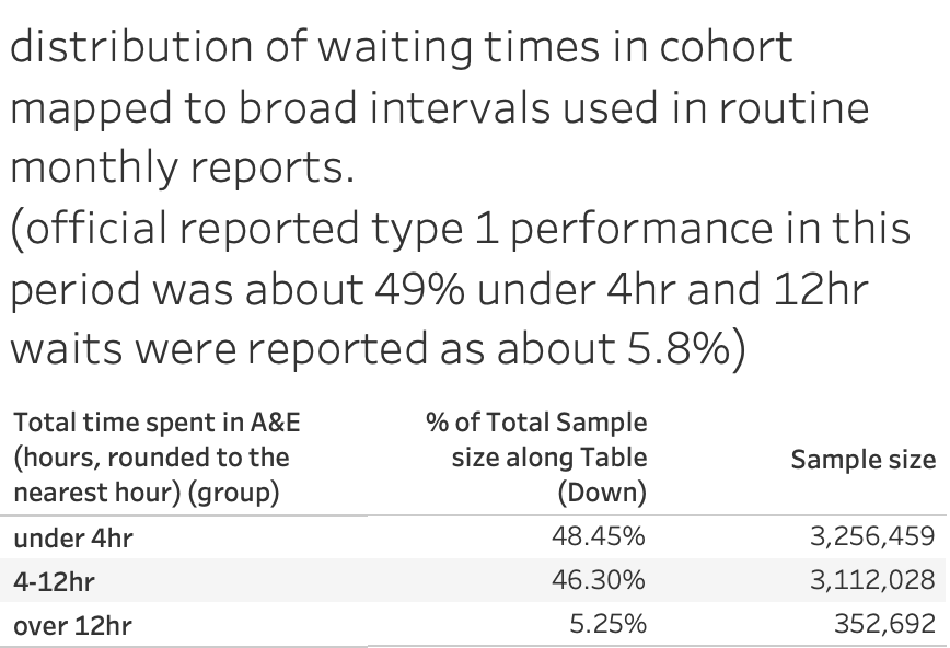


So the reported public waiting time statistics for this year are close to the ONS cohort despite the cohort being less than half the size of the total attends.


It is also worth noting that the reported proportion of wais over 12hr is close to the official annual reported number (close to 5.8%). This proportion has more than doubled since the year this analysis was done (december 2024, for example, had more than 10% of all attendance waiting more than 12hr.


All the other tables reported by the ONS don’t cite raw numbers but, rather, odds ratios after extensive adjustments to account for confounders. The details are not given (which may cause some complaints).


In most cases the odds ratio describes the probability of mortality for a particular waiting time group relative to the chosen comparison waiting time (which, I think, means the group labelled 2hr). The waiting groups, technically, mean all the waits that round down to the number. So the group labelled 2hr means all patients waiting between 2hr and 2hr 59mins.


The important message which stands out–whatever the method–is that long waits are bad for mortality in every subgroup even after extensive adjustment for other factors. Sometimes the effect of long waits is very bad. This is a stronger result than the EMJ analysis. 


So what do those results look like?


This is the analysis by admission status:
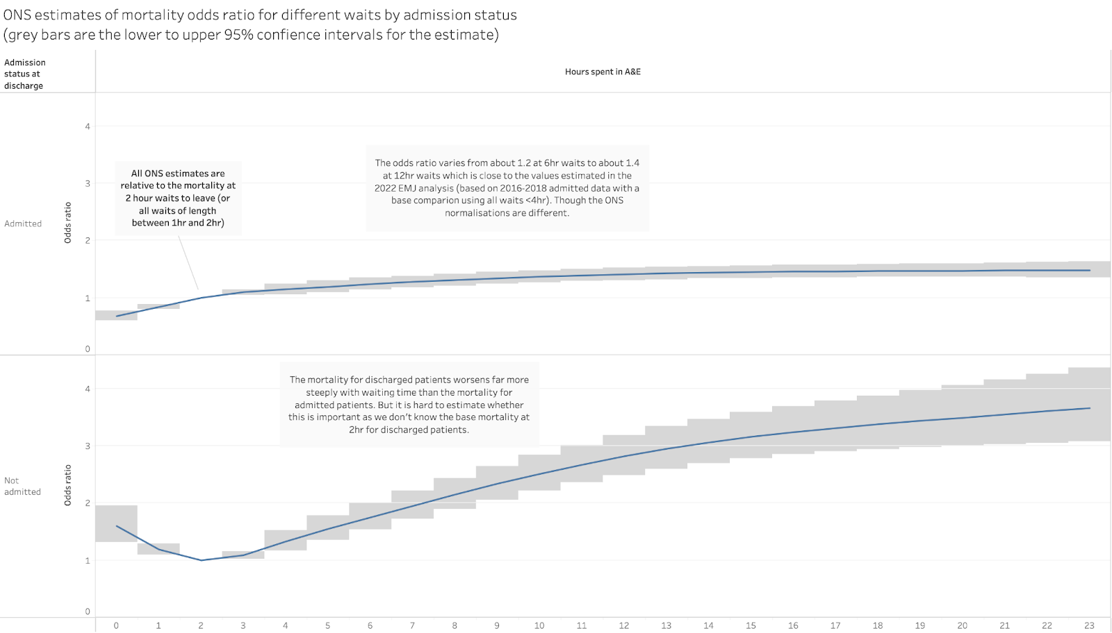


This shows the different effect of long waits on mortality for admitted patients and discharged patients. Mortality for admitted patients clearly rises with longer waits and rises by about 30-40% for waits of 8-12hr (not grossly different from the analysis in the EMJ paper).


The mortality rate rises far faster for discharged patients, with the rate nearly doubled for 8hr waits and tripled for 12hr waits. This is important as previous estimates of excess deaths ignored mortality in discharged patients.


But we can’t judge from this data whether mortality is worse for discharged patients because the base mortality isn’t shown for either group (this observation applies to all the odds-ratio data presented by the ONS and is a big issue when trying to judge the importance of some of the results). We know that admitted patients are perhaps 10 times more likely to die than discharged patients so a small increase in their mortality means more deaths than a similar increase in the mortality of discharged patients. 


The message would be far stronger if the ONS released the additional data they must have for the base mortality rates and the number of patients in each wait group (then we could calculate the total excess deaths easily as has been done with the EMJ analysis). 


But I don’t want to undermine the message that still stands out in this analysis: long waits are bad for patient mortality even when you adjust for all the possible confounding factors.


The ONS also analysed the effect on the mortality in different age groups:
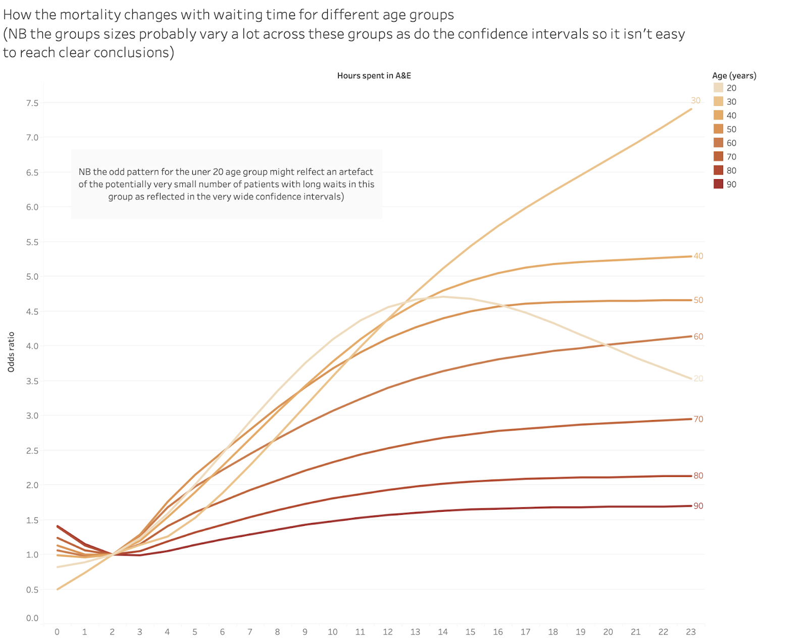
Again, the mortality mostly rises with waits over 4hr, sometimes by a lot. Again it is hard to judge how many deaths this adds up to because we don’t know the base rates for any group. And there is the strange pattern for waits for the young (I think the band labelled “20” means anyone under 20). But this might be a product of having very few long waits in that cohort. Also, children’s A&Es have far better waiting performance than others.


This possible explanation is reinforced by showing the age odds ratios with the statistical confidence intervals:
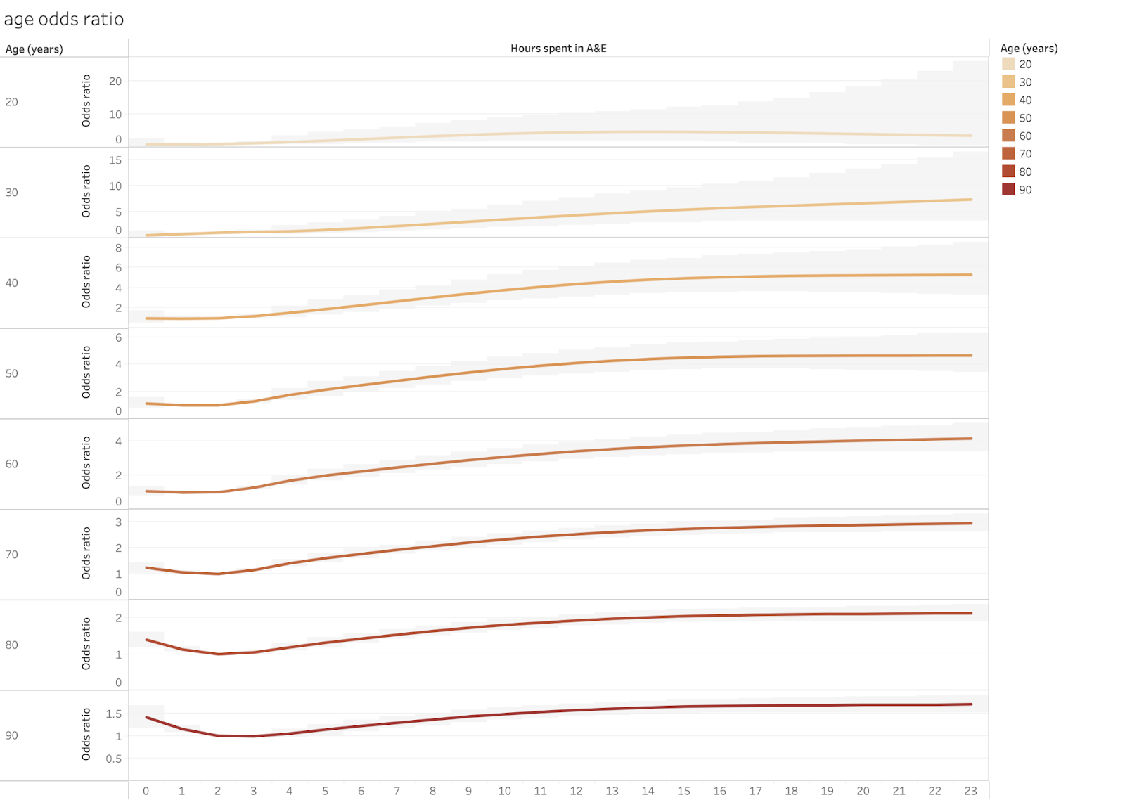


Note that in this chart the scales for each cohort are different to accommodate the large 95% confidence intervals and very different odds ratios for some groups. Those intervals are strongly driven by the sample size so very wide intervals imply a small and potentially unreliable sample.


The ONS also analysed the odds ratios by the primary complaint at arrival. This is that chart:
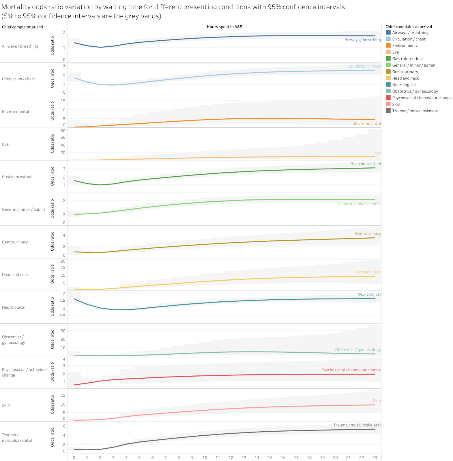


There are some odd anomalies here, mostly in groups which probably have small sample sizes. 


The results are clearer if we stick to a single time cohort and compare the odds ratios for each condition. 
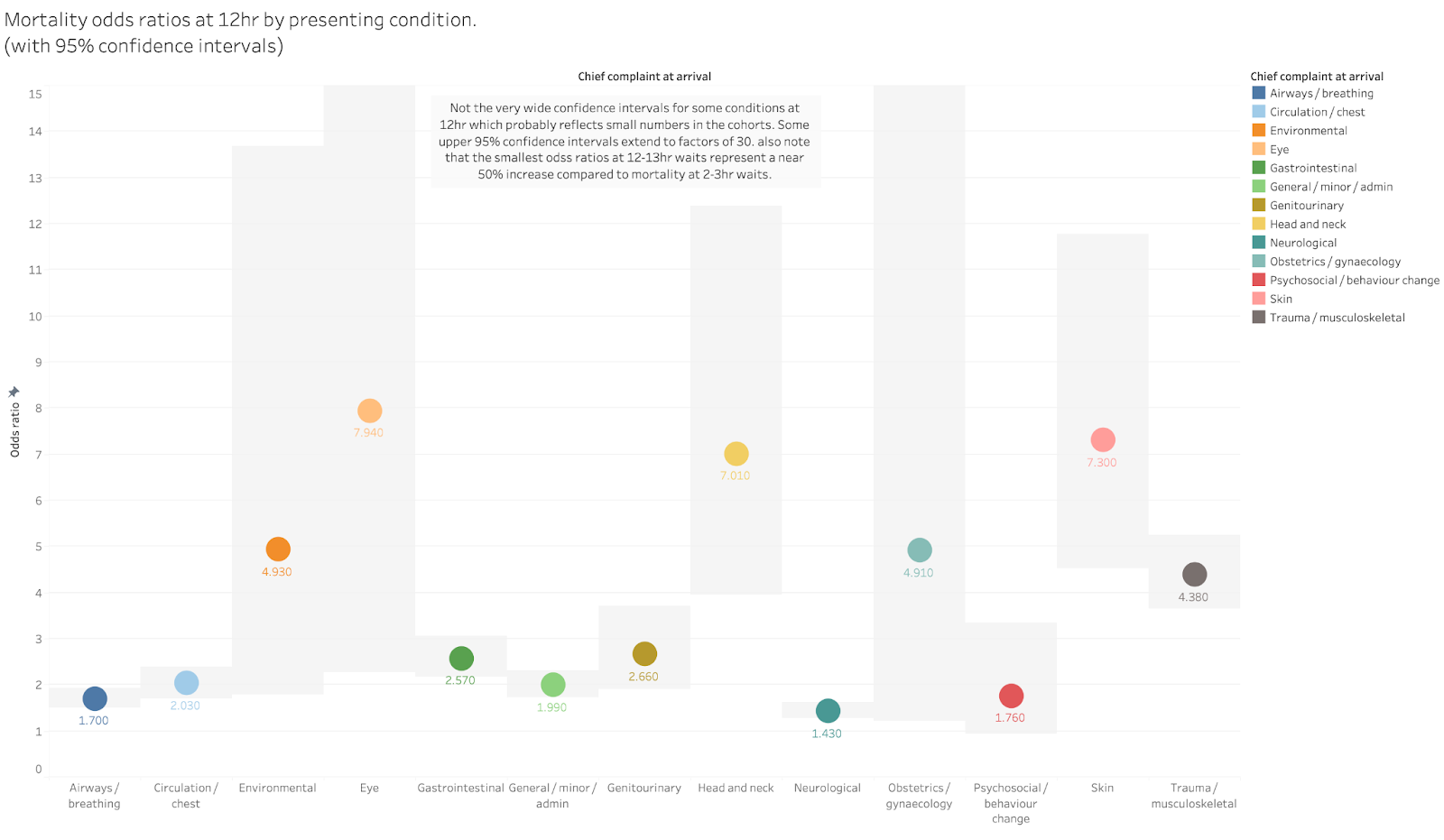


The highest risk increases are in the groups with the widest error bars so might be unreliable (again if the ONS gave us the raw cohort sizes we could make a better judgement).


But the key message remains unchanged. At 12hr the mortality risk is between 50% and 400% higher than at 2hr even for conditions where the confidence intervals are tight.


Problems with the ONS data

While the key message of the analyses are clear, there are problems in how the ONS have chosen to present the results and one major potential issue with the data. Both might be used to undermine the results but are also easy for the ONS to fix without doing any more analysis.


The biggest issue is the size of the total cohort. The ONS claims to have a near-comprehensive dataset of people attending A&E. They claim to have omitted some data but hint that this didn’t cause large numbers of omissions. But their complete cohort only has 6.7m patients when about 16.1m attended A&E in the period. That’s a big gap.


It may not matter as the 6.7 m seems to be fairly representative of all attendances. But the failure to report where the missing records went is annoying. It might even be an error caused by their unfamiliarity with A&E data. Good A&E analysts will have approximate numbers of total attendance in their heads and will instantly wonder, as I did, why the sample is only 6.7m big. It is possible that the ONS accidentally omitted a big chunk of their data and nobody noticed the gap and, therefore, didn’t see that there was anything to explain. They claim to have collaborated with the RCEM, DHSC and NHSE but someone there should have noticed this gap (though, cynically, I might question the motivation of NHSE to correct errors given their track record in downright denying the EMJ analysis).


The other problems with the analysis as presented is that it omits the information needed to translate the analysis into simpler, starker counts of the number of excess deaths (a number that seems to have been very effective in getting journalistic and public attention).


This could be easily fixed without further analysis. The ONS could simply provide the actual base rates and cohort sizes for each analysis. As the analysis currently stands we don’t know, for example, the number of 80 year olds in the sample or the proportion of the attenders who were admitted.


So we can tell that the rate of death rises with longer waits but not the number of deaths that leads to. 


Conclusion

The key message should not be ignored. Long waits kill patients. 


This is particularly important given that the number of long waits has risen rapidly and is still rising. The annual total waiting more than 12hr is ten times longer than when the EMJ analysis was done and has more than doubled since the time covered in the ONS analysis. 


But A&E performance is not a current top NHSE priority. And what is being set as the performance target by NHSE is based on an unambitious goal for 4hr performance. Some of us and the RCEM have suggested that A&E performance should be as important, if not more important, an improvement goal as elective waits. And that the first target for A&E performance should be to eliminate 12hr waits not to make minor improvements in 4hr waits.


I’m sure that the response to these results will contain a phrase something like “long A&E waits are completely unacceptable” perhaps accompanied by “everyone is trying extremely hard to improve A&E performance”. This is the stock answer when the consequences of A&E crowding hit the headlines. But, as Yoda said in Star Wars: ”There is no try: there is only do or not do”. Right now there is a lot of trying but not much doing.


Tuesday, 17 October 2023

NHS Digital’s Annual report on A&E performance is a mess and could be much more useful

The structure of the data as released and the interactive tool to visualise it are a mess of bad choices that get in the way of helping other analysts derive useful understanding from the data. They could do much better. 


Every year the vestigial stump of number crunchers in NHSE who still brand their work as NHS Digital produce a report on the previous year's A&E performance


The good thing is that the latest report releases far more data than has been normal in the past. There are many new breakdowns and extra pieces of data summarising what happened. And there is some interactive data visualisation. Unfortunately the effort to visualise the data screwed the pooch by being worse than useless.


There are some problems with the data as released as well but the big errors are in the choices made visualisting it. I could have some fun satirising the bad choices but, since I know that someone in NHSD reads at least some of the things I say, I want to provide some critical feedback on specific issues alongside some suggestions about how to do better in the hope that improvements can be made. 


Some of the charts contain spectacularly bad choices of what to include


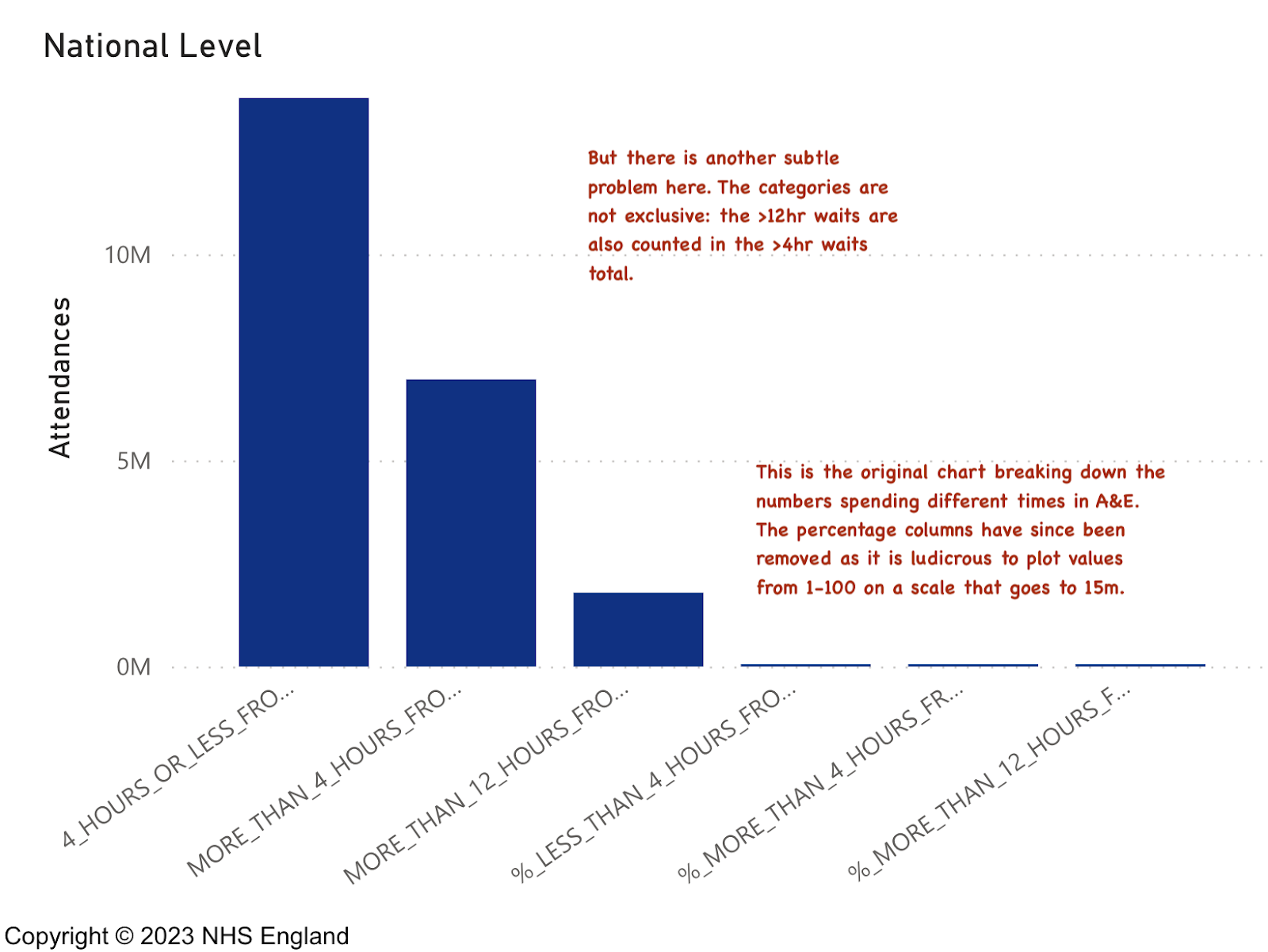
Take the original version of this chart which does contain some very interesting information:


It is important to know how many patients waited >4hr (it is the key performance target) and how many waited >12hr. It is good to know the total number of patients waiting in each category and also the proportion of each as a percentage of total attendance. But the percentages (by definition numbers between 0 and 1 or 0 and 100 depending on how they are presented) are plotted on the same scale as attendance (a scale from 0 to about 15m). So, by plotting them on the same scale, the designer has guaranteed we can't see the percentages. In effect, presenting the data this way makes it impossible to see the key statistic any user needs to see. (and don't get me started on the unreadable diagonal labels: the designer could have truncated the names to be readable or rotated the chart 90° to make them horizontal and easier to read.)


To be fair, they partly fixed this chart (possibly because I pointed out the absurdity on Twitter).


I quote the original version of this example because it illustrates the problem across many of the visualisations on the site. It is as if the manager who demanded the data be visualised gave no guidance as to what was important and allowed some PowerBI developer to just dump the data into whatever default dataviz PowerBI chose without any consideration of useability or relevance.


Doing this is a chronic waste of time for both the developer and the user. The result is to distract from the data rather than to highlight the important parts of it.


There is another, more subtle, problem with this chart: the plotted values are not, as the visualisation implies, separate. The total shown for the >12hr metric is also included in the >4hr metric. Were the metrics plotted in a simple table this might not be such a problem. But in a chart like this the visual implication is that they are independent. 


Yes, we need to know those metrics, but the underlying information has other useful data about the distribution of waits. Unfortunately the data doesn't seem to contain the best way of showing the overall distribution of waits which can provide insight into the nature of the problem in a hospital's processes. 


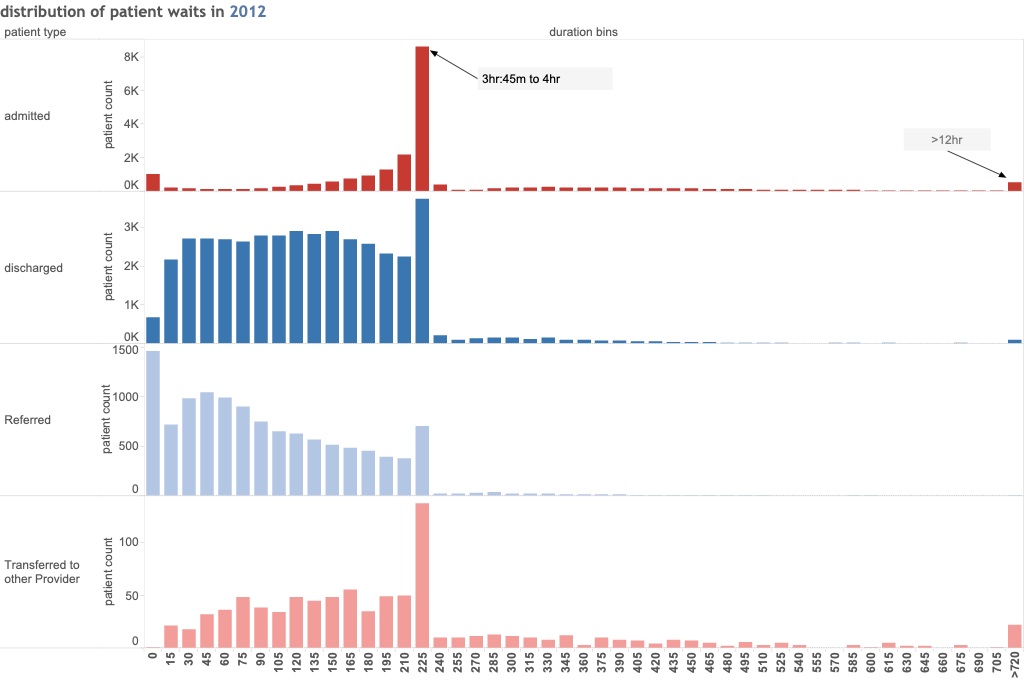
To illustrate what could have been done here are some old charts displaying more complete data on the distribution of waits (which is present in the source ECDS data). These are based on some work first done around 2010 by some A&E experts to better understand the differences between hospitals, but which are also useful inside a single department to highlight certain common issues. 


The A&E Tzar in 2010 thought that a typology of the shape of charts like this could identify a range of common performance problems and do so early so breaches of the major targets could be corrected before they happened.


This type of chart (in this case from a poor performer in 2012) illustrate how a simple comparison of the distribution of waiting times can provide some insight. The basic chart shows the number or proportion of patients waiting for different times. Each column is a 15min block of waiting times and shows the proportion who departed with a wait of that length. Patients types are shown separately to highlight the stark difference in waits for different categories of patient. In this case there is clearly a much bigger problem with admitted patients tna for discharged patients. These patterns can signal the need to act even before the whole hospital breaches the 4hr target (what the shapes look like now nobody meets the target would be fascinating and informative).


Even the simple version of this chart (with no separation of patient categories) is still useful. Indeed, NHSD used to publish something similar for waiting times (if I remember correctly, they used 10min intervals, not the more natural 15min and grouped all >4hr waits together) but, unless I missed it, this is not available in the latest release. But all the data needed to reproduce my version of those charts is present in the original ECDS source and providing this sort of analysis of waits would have been a great service to all A&E analysts. 


But NHSD didn't release this sort of chart nor the aggregate data needed to build it for each trust. If they had it would have been a major benefit for all who care about the data but don't have access to the raw patient level ECDS records to recreate it themselves.


Other charts have the same type of problem


But, since NHSD are responding to criticism, let me try to make some more suggestions about how to do better with the other charts. 


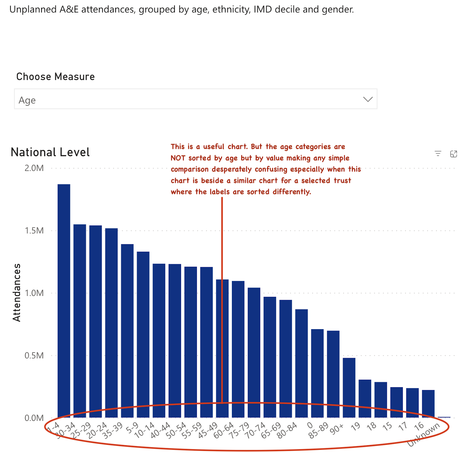
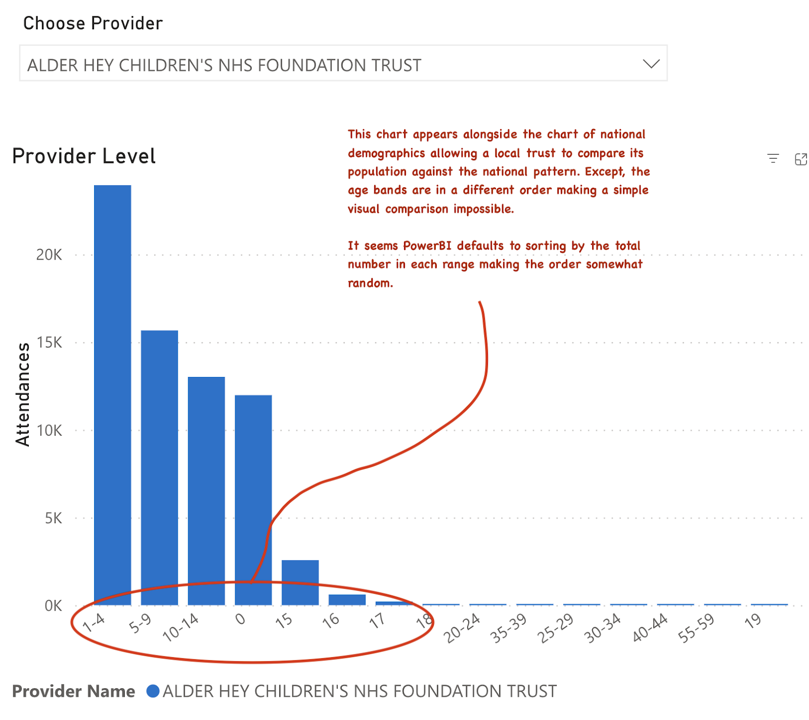
So here is how the national level age structure of A&E attenders is presented. In this case there is also a chart where this data can be seen against the structure in a specific trust for comparison purposes. This is sometimes a useful comparison to make and it is certainly interesting to see the age structure of demand. So bonus points for knowing that this comparison is useful.


But there is a very basic problem with how the data is presented: the data isn't sorted by age (it seems to be sorted by the size of the attendance in each group, which is useless and arbitrary). 


And the chart sits beside another chart of the demographics at a selected trust. But, since the sorting on the age groups is by volume not age, the scale is sorted differently. This makes any visual comparison of national versus local age distribution impossible. Anyone needing to see the comparison would need to completely redo the charts themselves from the raw data.


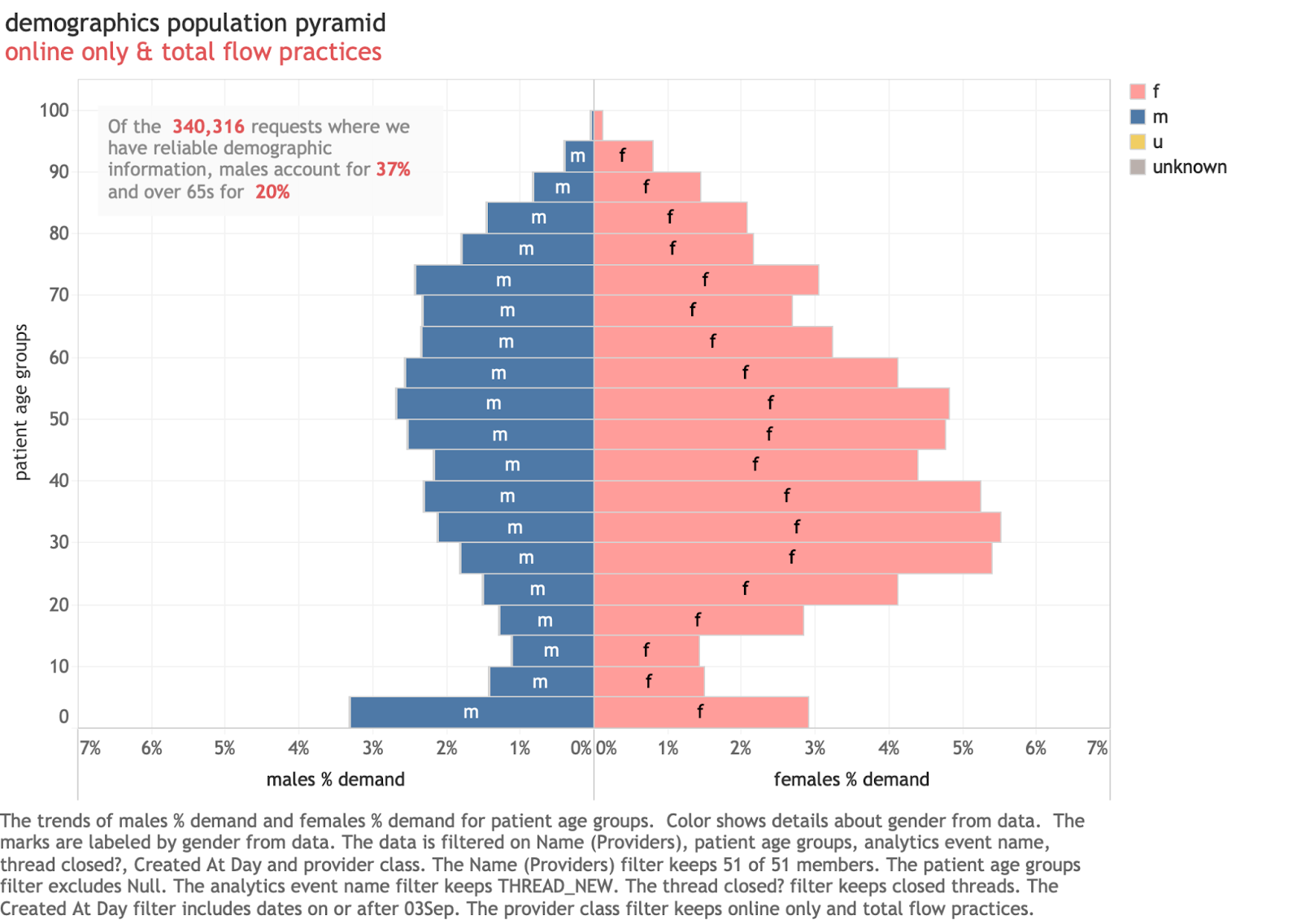
And there is a commonly used way to display information like this: the population pyramid. Here is an example from a different dataset:


This is actually from a GP system and illustrates a familiar way to present population information. It has several features that can't be done with data from A&E systems as released by NHSD. The gender mix is useful to know (eg it is very clear here that more women use the service than men). The age bands are consistent sizes (5 years each) which makes interpreting the overall pattern easier. And they are sorted correctly by age which improves the consistency of the patterns. 


This is the sort of chart demographers almost universally use for exploring population structures. The ONS website has interactive versions for exploring the UK population structure.


But we can’t do this with the A&E data. We can't compare by gender as the data in the A&E dataset contains gender but not gender linked to age bands. And the bands in the A&E data are inconsistent sizes in the data. Had the NHSD data been structured differently, a standard population pyramid would have been possible, but they seemed unaware of the utility of doing this and left age separated from gender in the data release.


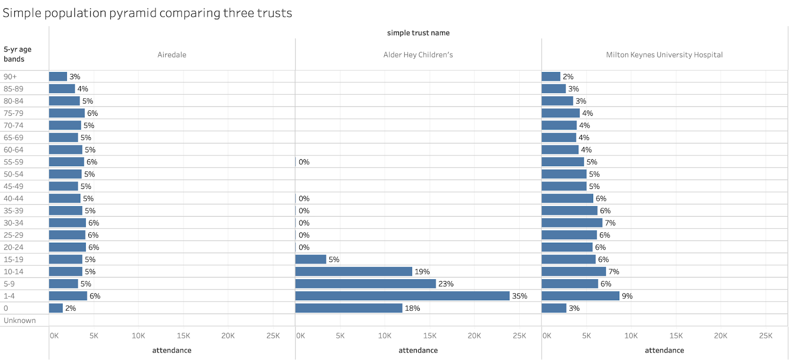
But we could still do a sort of simple population pyramid from the A&E data as a visualisation. And one that makes comparisons across trusts easier. In the chart below the A&E data is plotted using only minor adjustments (age bands are grouped to a consistent 5-years and ordered properly).

Were the linked data on gender present in the released spreadsheets, this could easily be converted to a more normal pyramid containing both the age and sex of the attendance.


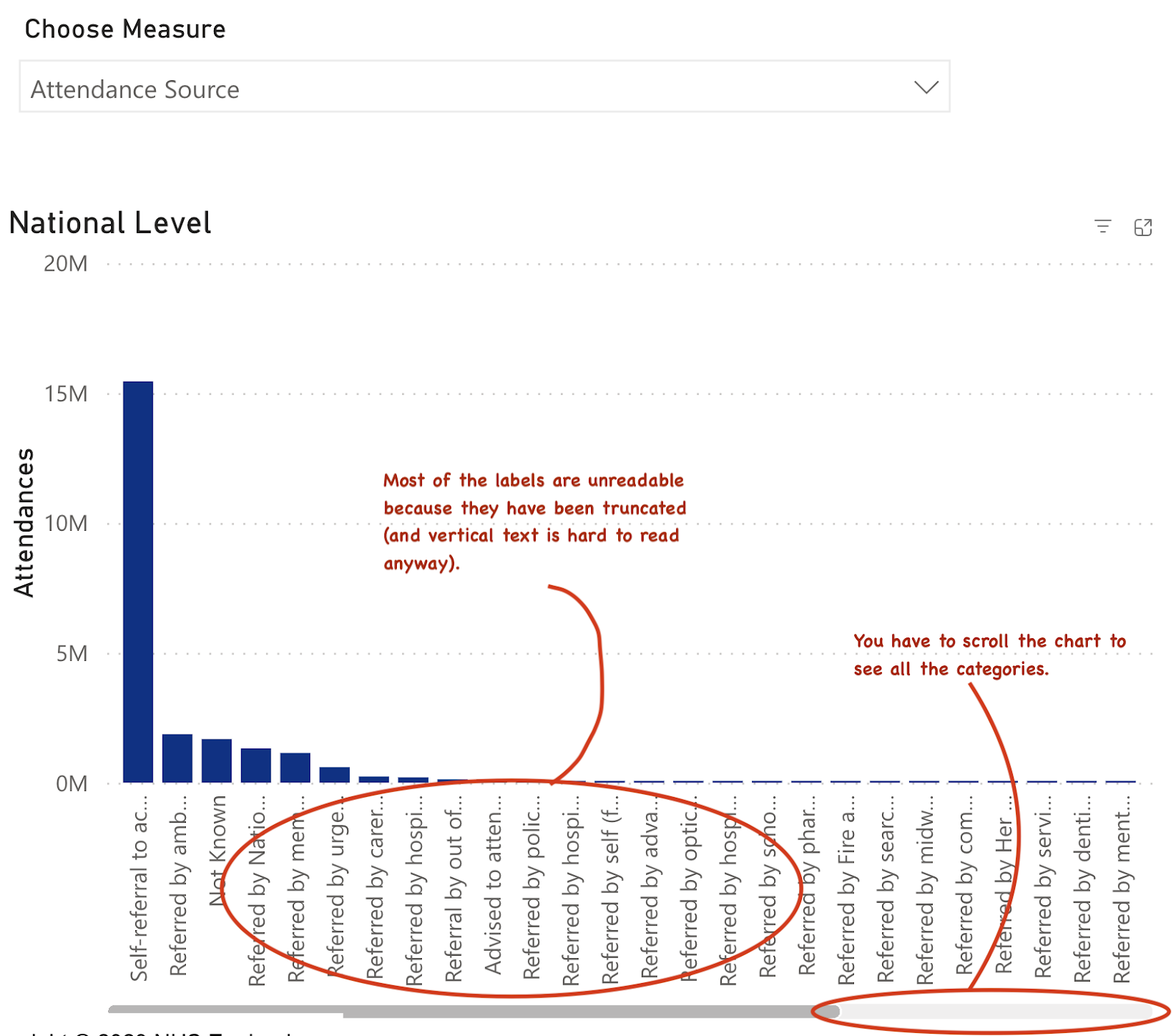
Another useful thing to know is where the volume is coming from. The data on referral source is available. The chart for this is below:


The biggest problem with this chart is the unreadable labels and the crowding which makes it hard to see all the data at once.


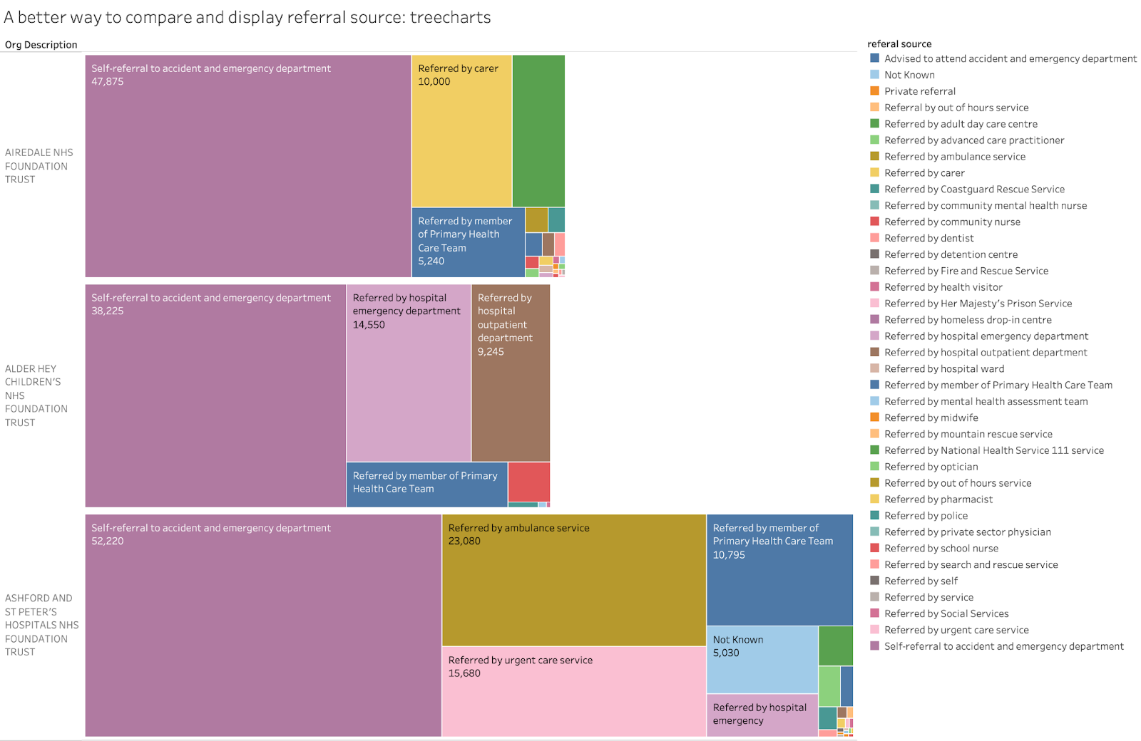
There is a better way to present this data that minimises those problems. The comparisons below use a treechart to visualise the data. This has some benefits: the visual comparison across trusts is accurate but, also, the biggest volume categories are the most visible, minimising the crowding of the chart by small or irrelevant categories with low volume. (in this case further work could highlight the major categories more effectively but this default chart already does a good job of highlighting major differences across trusts):


If the chart were interactive, the unreadable labels in small boxes in the treecharts could show pop-ups identifying the group (as the interactive version of the above chart does). This would minimise the loss of information because of unreadable labels.


One default chart in the Attendances section of the dataviz tool hints that the data contains a number of different classifications of attendance. But the chart is an abomination for multiple reasons. There are far too many categories and almost none of the labels are readable. But, worse, there are at least six different categories here which are unrelated to each other (e.g. deprivation, gender, ethnicity…). Of course, totalling things across independent categories gives a stupid, meaningless total (confusingly labelled "attendances") that visually dominates the chart. 


The very least that should have been done to make this useful would have been to group the various metrics together to show only related items (eg deprivation status, attendance source, discharge destination, ethnicity). As it is the chart does more to obscure the rich data available than it does to visualise anything useful.


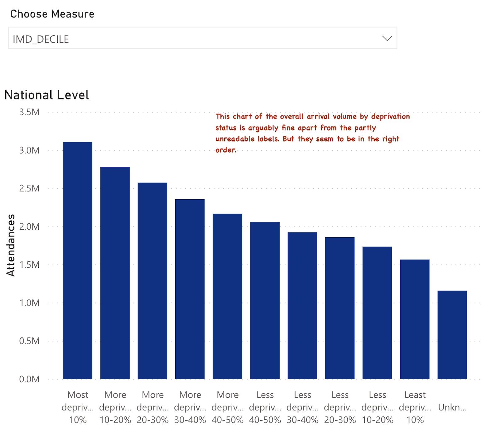
Some other charts in the pack do attempt the job of showing just one category from this data and allowing comparisons across trusts. For example there is an interactive chart that allows comparisons across trusts and to national data for the deprivation status of the attenders.


The national chart doesn't look too bad apart from basic readability and ugliness of the labels:


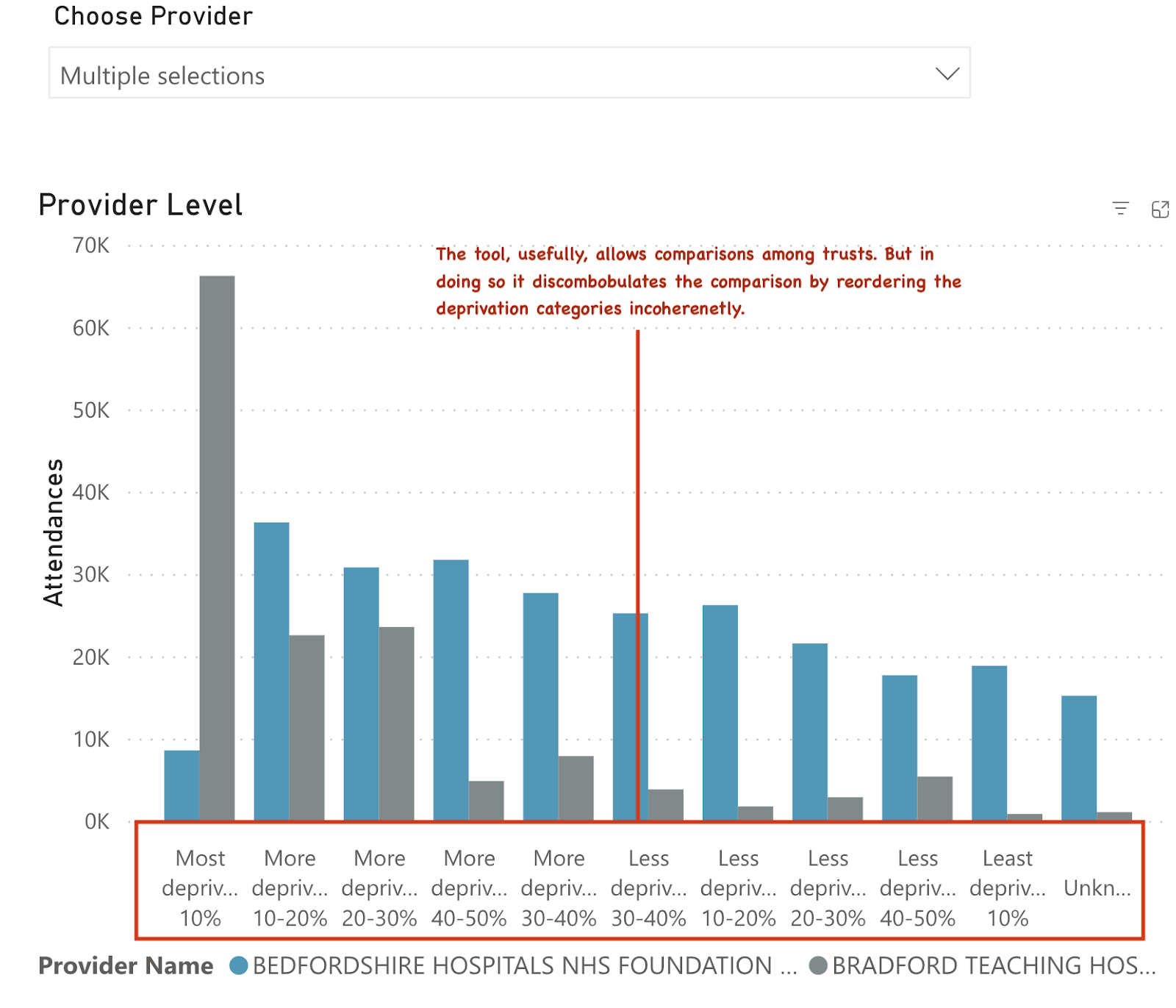
But it sits beside a chart intended to allow a comparison across multiple trusts and to the national pattern. But it looks like this:


The idea of providing comparisons is good. But to make the national comparisons, the order of the deprivation categories needs to be the same. And, while a diligent user could do a comparison among several hospitals, the overall pattern of their attenders by deprivation status is obscured because the categories have been scrambled somewhat randomly.


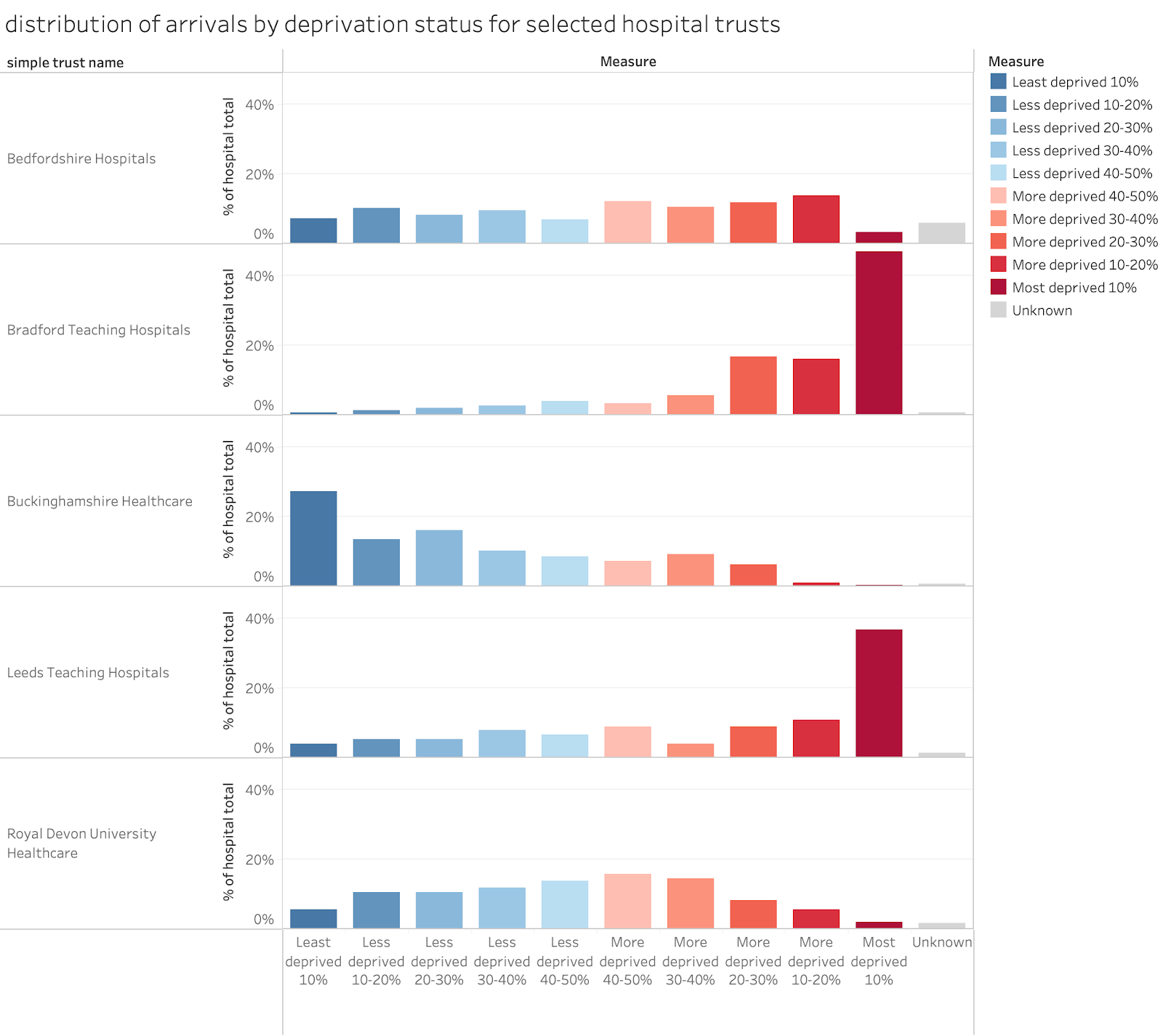
Here is an example from the actual data that shows what could have been done to make this more useful and coherent:


Here the comparison across hospitals is easier. A simple colour-code has been added to make visually scanning the labels unnecessary (more deprived gets deeper red, less deprived gets deeper blue). And the scale always runs in order from least to most deprived. The stark differences across the chosen hospitals in the deprivation mixes of their populations is very clear.


I could give even more examples but the ones above give a good range of illustrations of the very general issues in the NHSD visualisation tool. None of the charts have been customised in any way to make the dataviz more useful. Many end up so messy them make it impossible to make sense of the underlying data.


What general lessons can be drawn?


A general lesson for both visualisation and data structuring is very clear: it helps to know why and how the data will be used and what the best way to visualise it is.


But there are also too many examples where the structure of the data does not facilitate the sort of useful analysis that the majority of potential users might desire. For example, those who would like to analyse demographic data for linked age and gender as a standard population pyramid can’t do so as the data structure provides only gender totals but not the breakdown by age and gender. 


And, for those who might want to analyse the relationship between diagnosis, investigation and treatment they will find this can’t be done as, again, the three categories are not linked. Moreover, while the diagnosis and treatment data has ~1k distinct codes (which can be useful for researchers wanting to understand the mix of problems and treatments) the move to snomSNOMED CT coding seems to make it harder to group things together to get an overview (pre ECDS procedures were coded with OPCS codes and diagnosis with ICD10 codes which are both hierarchical systems which makes grouping related things together to get a broad category to obtain an overview much easier). SNOMED might allow this but the documentation of the coding is a mess and the links to the full data dictionary are often broken in the full documentation.


This may be an unfair criticism as many researchers will use the full patient-level records where many of these problems don’t exist, but what is the point of providing an annual summary with lots of detail but no way to link it across different categories or summarise it with existing hierarchies.


And providing a tool for data visualisation is a good way to enable users to navigate the rich data. But not if the structure of the data has been ignored in choosing the method of visualising it. And most of the choices of how to present the data are extremely bad choices. 


The dataviz tool looks like it was created by dropping data tables into whatever the default PowerBI choice of chart is (every chart seems to be a vertical bar chart whatever the data looks like). For some charts this is fine, but even when this a good choice of chart type, the details have often been mangled. There is no point in presenting breakdowns by age if the age categories are not in order, for example.


There is also vital information missing. Some data, as I demonstrated above, is extraordinarily useful for understanding performance. The shape of the distribution of waiting times is a good example. The data release could have presented the distribution of waiting times in detail. Instead of that we get some of the simple statistical summaries (median waiting time, mean waiting time and the 95 percentiles). These tell us something but showing the full distribution (in 15min or whole hour groups) would have been far more useful. 


Final thoughts

This is a missed opportunity by NHSD. They wanted to release far more detail than usual in the report. But they have chosen which details to present poorly and have failed to consider how users might want to use the data.


And in choosing to offer an interactive visualisation they pay lip service to a good idea. But, by failing to pay the minimal attention to the basic principles of good visualisation, they have created an epic fail which obscures rather than enables a better understanding of the data. It might be used in future as a cardinal example of how to do dataviz badly.


It is fixable, though. And they have already changed some of the most egregious examples on the basis of public criticism. But the whole approach needs a complete rethink taking into account what reasonable users might want to do with the data.


There are still some people around who know which parts of the data are important and how to visualise them (some in think tanks, some in the better CSUs and some independents). Heck, I’ve been analysing and visualising A&E data for over 20 years. 


NHSD could usefully consult with some of the experts to rethink the whole release and the dataviz based on it to make it far more useful.