Pages

Showing posts with label policy. Show all posts

Friday, 6 June 2025

The new NHS UEC plan: a huge improvement but still not good enough

A quick, critical look at the key ideas in the new UEC plan 

[NB: updated with extra comments on June 8]

The new NHS plan for improving emergency care is out. 


It is a huge improvement over previous plans. I don’t often praise NHS plans especially on emergency care, but this one deserves at least some praise. But it is far from perfect and still has flaws carried forward from previous thinking.


Let’s look at the details.


What is better

It is far more honest than previous plans about the truly awful performance of the current UEC system. And finally admits that this performance is one of the critical factors that has cratered public trust in the NHS.


§12 begrudgingly admits that the the problem “...has only in part been fuelled by an

ageing population and an increase in multiple long-term conditions…”. This is better than previous plans that have often asserted that demand is the problem. But a clearer statement that demand isn’t the cause of the problem would have been welcome (and, §11 seems to vastly overstate the demand growth).


§13, §15 and §20 admit that coordination failures and “blame shunting” are part of the problem and should not be tolerated but overemphasises the blame shunting and coordination failures across organisations and under emphasises the significance of those failures inside providers which are probably more significant.


§23 stresses the critical importance of leadership. This is useful as getting hospital leaders aligned on the importance of A&E performance was one of the key factors that delivered the original 4hr target in the years to 2005 (when it was first met with a 98% standard). But, on the other hand, a great deal of NHS policy since 2010 has burdened and confused hospital leaders with a mountain of competing and often incompatible targets.


Perhaps the most important promise is in §21 which promises better, more transparent data on performance. The RCEM have long proposed publishing better site-level data and this should vastly improve transparency and reduce the opportunity for gaming by unbundling the major A&E sites from unrelated UTC sites. Publishing transparent 12hr wait performance will highlight the most harmful waits and minimise the incentive to game 4hr performance at the cost of worse 12hr performance. Having a target for 12hr waits has long been neglected in previous plans and is a vital first step in driving a reduction in the harm and mortality caused by long waits (while waits of 5-11hr also increase mortality, the 1.7m waits over 12hr (as the system has seen for three years in a row) see the highest mortality increase and reducing them first will yield the biggest benefits). 


§74 to §79 promise some better focus on issues and interventions related to better performance management. That’s good. As is the emphasis on the importance for local leaders to be focussed on performance managing this problem.


The plan has some refreshing acknowledgement of the problem of long waits for patients with mental health problems. This has been a longstanding problem for some hospitals and specific actions to improve handover specialist mental health services is welcome.

What is still wrong

While this plan is considerably more focussed than the previous plans, it is still not very focussed. There are too many goals and some of them are not consistent. the dominant goal should be reducing waits in A&E: everything else should be about how to achieve shorter waits. Given the extraordinary mortality caused by long waits (see this blog) any other focus is distracting and harmful. And, since demand is not the primary cause of long waits, the space in the plan given to demand reduction initiatives is futile. Demand is not the problem.


The plan also fails to acknowledge the biggest and most compelling reason why reducing long A&E waits is vital: they kill patients. Mortality rises notably when waits are significantly longer than 4hr and the latest estimates of how many extra patients die from those long waits suggests that perhaps an extra 40k-60k annual deaths were being caused by them in 2022 when there were fewer than 950k 12hr waits. There have been more than 1.7m 12hr waits in each of the three years since then, suggesting excess deaths might exceed the mortality from covid, UK military deaths in WW2 or Russian battlefield deaths in Ukraine.


The plan is also somewhat confused about the difference between goals and metrics. It is also confused about the difference between fixing the root causes of the problem and improving the superficial symptoms of the problem. Long ambulance waits, for example, are caused by long delays inside A&Es and, if A&E is not fixed, there is little point in separately setting targets for ambulance handovers (unless there is strong evidence that specific failures in ambulance processes are adding extra delays which the plan does not provide).


§11 claims “Since 2010/11, the number accessing UEC services has risen by 90%”. I have no idea what they are counting here. Major (type 1) attendance is up less than 20% and even UTC attendance (type 3) is only up 45%. The performance problem is all in major A&Es and demand is not the problem there. Most UTCs do not have a performance problem and still meet the 95% 4hr target nationally.


While the idea of having a target to reduce 12hr waits is good there are two problems. 


The first is that the target is unambitious. Reducing 12hr waits to under 10% of attendance is shockingly unambitious. We have had three years where moer than 1.7m people waited over 12hr (probably leading to 10k-12k unnecessary extra deaths). A target of eliminating 12hr waits in 2 years might have been better, if ambitious.


The second is that the 12hr target might have been more effective if it temporarily replaced the 4hr target. It should be a step towards improving A&E performance and eventually recovery of the 4hr standard, not a supplement to it (which leaves incentives to game 4hr performance in place.)


The plan chose to retain a 4hr target instead of temporarily replacing it with a 12hr focus. But the 4hr goal it sets is incredibly unambitious and confusing. It is confusing as it is still a "system" target which includes the performance of UTCs (type 3 units) who don't have problems. This encourages gaming of headline performance instead of a focus on the units where the problem is focussed, the major A&Es. The plan should have changed the metric to apply only to major A&Es (and if site level data is going to be published, major A&E sites not multi-site trusts). This change would make the 78% target far more ambitious. Current whole-system performance is in the mid 70-percent range. Current major A&E performance is averaging around 60%. The target should focus on where the improvement is needed.


§22 to §43 consist of two sections focussed on reducing demand. Some of the individual ideas are sensible (more flu vaccination is a generally good idea whether it reduces A&E demand or not). But, since demand is not the major cause of poor A&E performance, the volume of efforts to reduce it are mostly irrelevant to the problem at hand. I’m not saying don’t do the good things recommended in these sections. But I am saying that these things are a major distraction from fixing A&E performance and a focus on the handful of significant actions to achieve that would achieve more improvement.


The promised improvements in data transparency are very significant. But the section on digital investment (§69 to §73) is full of wishful thinking. I doubt that joined up care records can make much different to A&E or ambulance performance however many other benefits they have. 


§72 is right to point out that “Rolling out the FDP is one thing: ensuring it is used effectively is another.” The point that implementation matters has rarely, if ever, been admitted in previous NHS strategies. But the belief that the Federated Data Platform is transformative is naive. As is the belief that better forecasting of A&E demand is useful. A&E demand has always been very predictable. The biggest operational problem is, and always has been, matching operational practices to the very-well-known demand patterns. The idea that better forecasting might help is pure snake oil (especially if AI based). 


What is irrelevant and silly

The introduction to the plan claims in §1 that “the 10 Year Health Plan will set the

most transformative agenda we have seen in over 2 generations.” §16 places the same mistaken faith in the ten-year plan.


This is silly. The ten-year plan–at least what we have seen about its content–is absolutely not transformative. At best it is irrelevant to the current NHS crises; at worst its development has been a huge distraction from the need to tackle them. The NHS should not be placing any hope in the transformation it promises–it might have noble and useful ambitions–but it completely lacks the practical steps needed to deliver its promises. Moreover the goals of the ten-year plan won’t fix any of the problems causing poor A&E performance anyway.


And, while the promise of improved transparency on critical performance data is good, the idea that the major national digital programmes (like the FDP or the Connected Care Records Programme) will make big contributions is a fantasy. Offering a far bigger programme of training in operational improvement and management with better recruitment and training for analysts (all merely hinted at in §76) would be far more useful.


Conclusion

While the plan has some huge improvements over previous UEC plans, it still has too many distractions from the focus needed to tackle perhaps the biggest performance problem in the NHS. Improvement might happen faster with an even tighter focus on the handful of actions that would tackle the major bottlenecks to better performance and fewer distractions carried over from previous strategies that largely assumed the key problem was demand.


Sunday, 19 January 2025

Making sense of the new ONS estimates on A&E waiting times and mortality


Long waits in A&E kill patients. A new analysis of mortality and A&E waits by the ONS–despite issues in the analysis and presentation of the results–makes this look like an even bigger problem than previous analyses.


In January 2025 the Office of National Statistics (ONS) released a new analysis of the relationship between A&E waiting times and mortality. 


This is an important study because understanding when NHS performance is killing patients unnecessarily is a major indicator of where the system’s biggest and most important problems are.


But the results will be more contended and confusing than they needed to be because the ONS have presented them badly and have omitted some key data that make the importance of the results harder to judge and harder to compare with previous analysis.


This note is an attempt to explain the significance of the ONS results while also suggesting some of the improvements that could be made to make the results more useful.


The background to this analysis

The ONS are not the first to attempt to estimate the excess mortality caused by long waits. A previous analysis (of which I was a co-author) was published in 2022 in the Emergency Medical Journal and also used NHS patient-level data to derive reliable estimates of the relationship between long waits and mortality. 


This work was partly inspired by a previous Canadian study which also concluded that longer waits substantially increase mortality but with less reliable data on length of wait (the UK studies use data that contains the wait for individual patients).


The EMJ study, which has been extensively used in campaigns by the Royal College of Emergency Medicine (RCEM) to highlight the apocalyptic state of English A&E departments, used comprehensive data from april 2016 to march 2018 but only for admitted patients. Conservative estimates based on this study suggest that long waits cause between 10,000 and 20,000 extra deaths every year. The EMJ study did not estimate mortality for waits longer than 12hr due to the small numbers (which were below 2% of attendance in the period; they are over 10% now). The RCEM derived the excess deaths estimates using total published numbers for 12hr waits and the EMJ estimate of mortality for shorter waits of 8-12hr. Plus, recent estimates by the RCEM of excess deaths number were smaller than their original estimates as the EMJ data only covered admitted patients but recent NHS data says about one third of 12hr waits were discharged (an astounding statistic by itself) and the EMJ analysis did not estimate mortality for discharged patients.


It is notable that NHSE leadership’s response to the original publication was to dismiss the results. It is well worth reading the evidence session to the House of Commons Health Committee where Adrian Boyle of the RCEM presented the case and NHSE leaders dismissed it.


One argument too easily used to dismiss the importance of waiting times is that many other factors also influence mortality and some of them also increase waiting times, making describing the part of the excess mortality attributable just to long waits complex (though the EMJ paper went to great length to do adjustments and still concluded that waits were a big factor.


When rumours emerged that the ONS were doing an updated version of the analysis, there was some hope that it might swing the debate so the NHS would pay more attention to the problem. But the way the ONS chose to present their results blunted some of their possible impact as we shall see.


What the ONS did

The ONS created a cohort to analyse based on data from three datasets: the 2021 census (for demographic information); the ONS death registration data; and the complete NHS patient level data about all attendances to major (type 1) A&E departments for the financial year ending in march 2022.


The link to census data allows adjustments to expected death rates based on factors recorded in the census. The death registration data allows actual death rates to be analysed (the specific mortality metric is deaths within 30 days of hospital discharge). The A&E attendance data allows the analysis to cover all A&E attendances in the data. 


One important fact to note (in principle) is that this analysis is not based on sample data but on actual data. The total number of deaths is not an estimate but a count of actual deaths (so removing a major potential source of statistical uncertainty). This is also true of the EMJ analysis. There can be minor data quality issues because of poor data recording. For example, not all the patients in the A&E data can be matched to the other datasets (but this misses fewer than 5% of the total so should not be a big issue).


In short this should be a very high quality dataset leading to very reliable results.


In presenting the evidence the ONS chose to mostly present the adjusted data (so the mortality differences are adjusted to take account of multiple factors other than waiting times that also influence mortality). The EMJ paper also did this adjustment but using a completely different method.


Only one dataset in the ONS release does not adjust mortality for other factors. But they did not describe their adjustments in detail or how many patients were omitted from the final cohort totals (this will be a big issue as described later). This lack of detail does not mean their results are not notable or important but it does create some opportunities to cast doubt on the conclusions (many of which will be unfair or downright wrong but the ONS could have avoided the potential for criticism if they had provided more detail).


What were the key results?

I’m going to go through the key results and present many of them as charts which are a lot easier to understand than the raw tables released by the ONS. In the next section I will describe some of the issues that could have been avoided if the ONS had released additional data they must have to have been able to derive the analysis they have done.


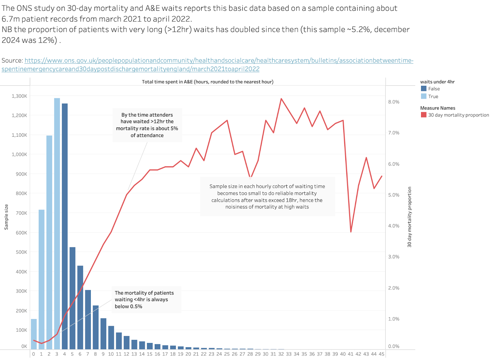
The first chart here presents the raw data in the cohort they used for analysis:


The bar chart shows the total number of patients who waited different amounts of time to leave the A&E. The data counts the total attendances and the total 30-day deaths for each waiting time. The chart shows the raw analysis as the proportion of people in each waiting time group who died. Below 4hr the raw mortality rate is <0.5% for all arrivals. By the time waits are 12hr long that number is about 5%. That’s a big increase but hard to interpret because, for example, perhaps the cohort waiting over 12hr contains far more old people who are far more likely to die. Other analyses have adjusted for many such effects.


The total number of patients covered in the chart is about 6.7m.


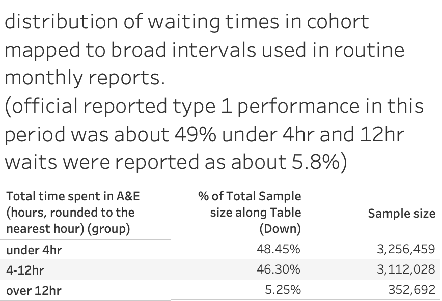
This, as will be discussed later, is less than half the number recorded as attending major A&Es in the same time period which was about 16.1m. Where did the missing patients go? The ONS don’t explain. So, is the cohort representative of the attendance? Probably. This table shows the stats on grouped waiting times for the ONS cohort:


So the reported public waiting time statistics for this year are close to the ONS cohort despite the cohort being less than half the size of the total attends.


It is also worth noting that the reported proportion of wais over 12hr is close to the official annual reported number (close to 5.8%). This proportion has more than doubled since the year this analysis was done (december 2024, for example, had more than 10% of all attendance waiting more than 12hr.


All the other tables reported by the ONS don’t cite raw numbers but, rather, odds ratios after extensive adjustments to account for confounders. The details are not given (which may cause some complaints).


In most cases the odds ratio describes the probability of mortality for a particular waiting time group relative to the chosen comparison waiting time (which, I think, means the group labelled 2hr). The waiting groups, technically, mean all the waits that round down to the number. So the group labelled 2hr means all patients waiting between 2hr and 2hr 59mins.


The important message which stands out–whatever the method–is that long waits are bad for mortality in every subgroup even after extensive adjustment for other factors. Sometimes the effect of long waits is very bad. This is a stronger result than the EMJ analysis. 


So what do those results look like?


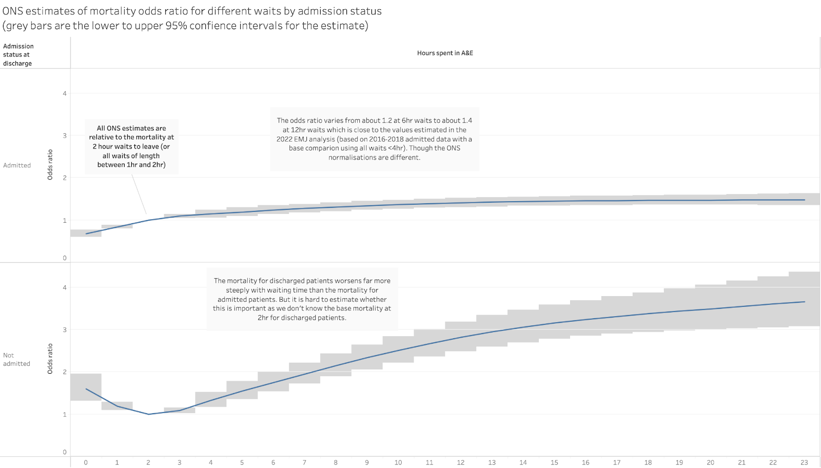
This is the analysis by admission status:


This shows the different effect of long waits on mortality for admitted patients and discharged patients. Mortality for admitted patients clearly rises with longer waits and rises by about 30-40% for waits of 8-12hr (not grossly different from the analysis in the EMJ paper).


The mortality rate rises far faster for discharged patients, with the rate nearly doubled for 8hr waits and tripled for 12hr waits. This is important as previous estimates of excess deaths ignored mortality in discharged patients.


But we can’t judge from this data whether mortality is worse for discharged patients because the base mortality isn’t shown for either group (this observation applies to all the odds-ratio data presented by the ONS and is a big issue when trying to judge the importance of some of the results). We know that admitted patients are perhaps 10 times more likely to die than discharged patients so a small increase in their mortality means more deaths than a similar increase in the mortality of discharged patients. 


The message would be far stronger if the ONS released the additional data they must have for the base mortality rates and the number of patients in each wait group (then we could calculate the total excess deaths easily as has been done with the EMJ analysis). 


But I don’t want to undermine the message that still stands out in this analysis: long waits are bad for patient mortality even when you adjust for all the possible confounding factors.


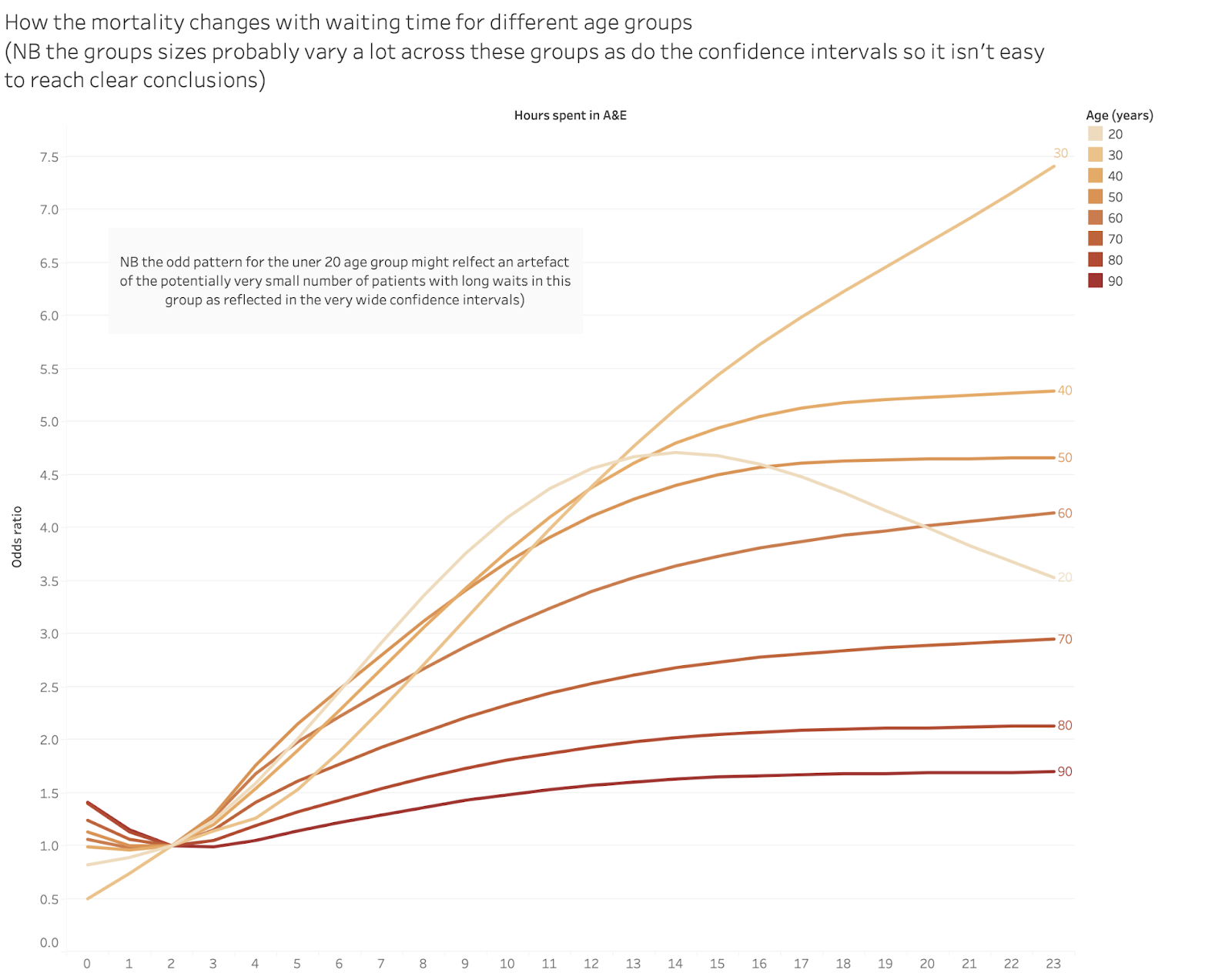
The ONS also analysed the effect on the mortality in different age groups:

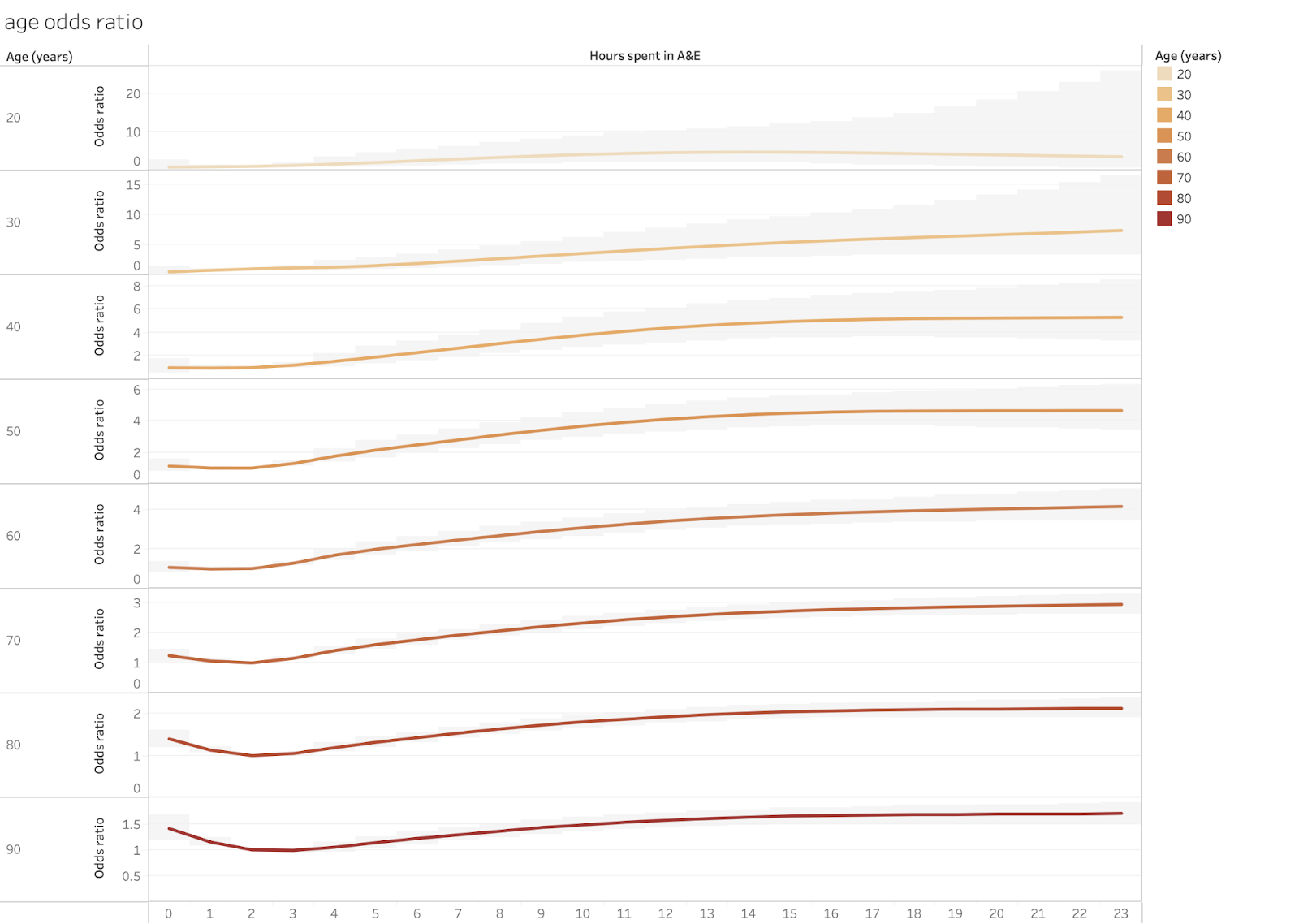
Again, the mortality mostly rises with waits over 4hr, sometimes by a lot. Again it is hard to judge how many deaths this adds up to because we don’t know the base rates for any group. And there is the strange pattern for waits for the young (I think the band labelled “20” means anyone under 20). But this might be a product of having very few long waits in that cohort. Also, children’s A&Es have far better waiting performance than others.


This possible explanation is reinforced by showing the age odds ratios with the statistical confidence intervals:


Note that in this chart the scales for each cohort are different to accommodate the large 95% confidence intervals and very different odds ratios for some groups. Those intervals are strongly driven by the sample size so very wide intervals imply a small and potentially unreliable sample.


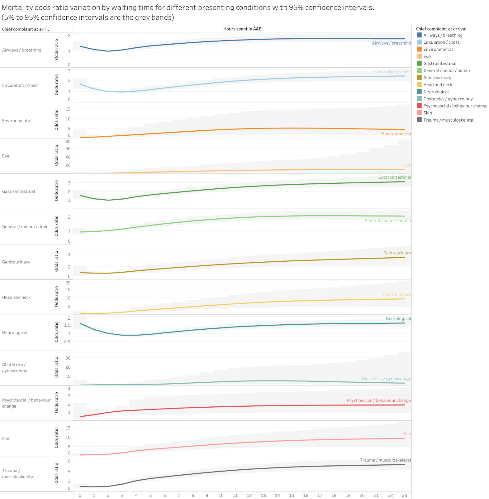
The ONS also analysed the odds ratios by the primary complaint at arrival. This is that chart:


There are some odd anomalies here, mostly in groups which probably have small sample sizes. 


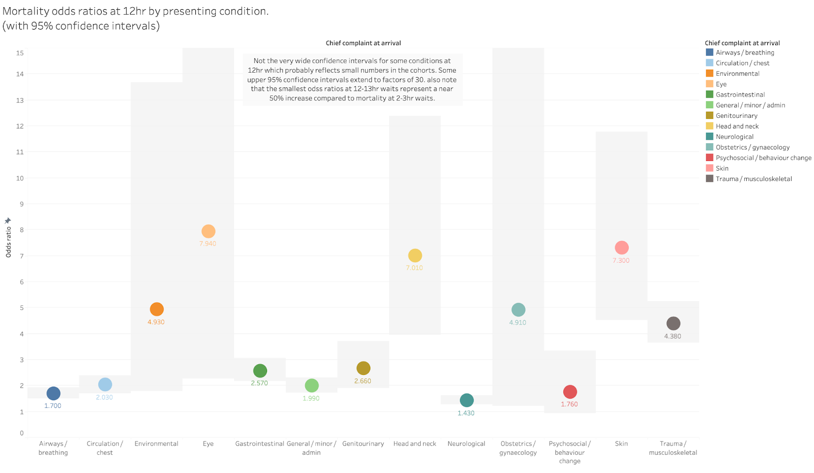
The results are clearer if we stick to a single time cohort and compare the odds ratios for each condition. 


The highest risk increases are in the groups with the widest error bars so might be unreliable (again if the ONS gave us the raw cohort sizes we could make a better judgement).


But the key message remains unchanged. At 12hr the mortality risk is between 50% and 400% higher than at 2hr even for conditions where the confidence intervals are tight.


Problems with the ONS data

While the key message of the analyses are clear, there are problems in how the ONS have chosen to present the results and one major potential issue with the data. Both might be used to undermine the results but are also easy for the ONS to fix without doing any more analysis.


The biggest issue is the size of the total cohort. The ONS claims to have a near-comprehensive dataset of people attending A&E. They claim to have omitted some data but hint that this didn’t cause large numbers of omissions. But their complete cohort only has 6.7m patients when about 16.1m attended A&E in the period. That’s a big gap.


It may not matter as the 6.7 m seems to be fairly representative of all attendances. But the failure to report where the missing records went is annoying. It might even be an error caused by their unfamiliarity with A&E data. Good A&E analysts will have approximate numbers of total attendance in their heads and will instantly wonder, as I did, why the sample is only 6.7m big. It is possible that the ONS accidentally omitted a big chunk of their data and nobody noticed the gap and, therefore, didn’t see that there was anything to explain. They claim to have collaborated with the RCEM, DHSC and NHSE but someone there should have noticed this gap (though, cynically, I might question the motivation of NHSE to correct errors given their track record in downright denying the EMJ analysis).


The other problems with the analysis as presented is that it omits the information needed to translate the analysis into simpler, starker counts of the number of excess deaths (a number that seems to have been very effective in getting journalistic and public attention).


This could be easily fixed without further analysis. The ONS could simply provide the actual base rates and cohort sizes for each analysis. As the analysis currently stands we don’t know, for example, the number of 80 year olds in the sample or the proportion of the attenders who were admitted.


So we can tell that the rate of death rises with longer waits but not the number of deaths that leads to. 


Conclusion

The key message should not be ignored. Long waits kill patients. 


This is particularly important given that the number of long waits has risen rapidly and is still rising. The annual total waiting more than 12hr is ten times longer than when the EMJ analysis was done and has more than doubled since the time covered in the ONS analysis. 


But A&E performance is not a current top NHSE priority. And what is being set as the performance target by NHSE is based on an unambitious goal for 4hr performance. Some of us and the RCEM have suggested that A&E performance should be as important, if not more important, an improvement goal as elective waits. And that the first target for A&E performance should be to eliminate 12hr waits not to make minor improvements in 4hr waits.


I’m sure that the response to these results will contain a phrase something like “long A&E waits are completely unacceptable” perhaps accompanied by “everyone is trying extremely hard to improve A&E performance”. This is the stock answer when the consequences of A&E crowding hit the headlines. But, as Yoda said in Star Wars: ”There is no try: there is only do or not do”. Right now there is a lot of trying but not much doing.


Monday, 3 October 2022

The NHS is a microcosm of the British economy

 The NHS is a microcosm of the British economy


Mistakes in how the government has managed the NHS parallel the mistakes in managing the economy. Trying to hold down the government budget is constantly approached by making easy choices rather than the right choices. The same is true in the NHS where the capital budget is raided to cover operating deficits. Both are recipes for long term decline.


All governments would like to see a higher growth rate in the economy. The current one wants to increase incentives with tax cuts but need to pay for those giveaways with spending cuts. But, faced with those spending challenges, they often take the easy road to keep the budget in some sort of balance by cutting the very capital projects that might improve growth in the long term. 


The parallel with the NHS is interesting. Growth in spending seems relentless. That growth can be constrained only by improving productivity. But the choices made to keep the budget under some semblance of control hurt productivity, making tomorrow's problems worse. In this way the NHS is like a microcosm of the whole economy, at least in the ways both have been managed in the last decade or two.


The economy

The link is explained by the factors known to affect productivity in the economy and the NHS.


As Sunak explained in his spring statement while he was still chancellor (my highlighting)


"Over the last fifty years, innovation drove around half the UK’s productivity growth.


…our lower rate of innovation explains almost all our productivity gap with the United States.


Right now, we know that the amount businesses spend on R&D as a percentage of GDP is less than half the OECD average.


Weak private sector investment is a longstanding cause of our productivity gap internationally:


Capital investment by UK businesses is considerably lower than the OECD average of 14%.


And it accounts for fully half our productivity gap with France and Germany."


His analysis is mainstream economics. But it is worth asking what governments have actually done about either innovation or capital spending over the last decade or two because the same factors matter not just in the private sector but in the parts of the economy controlled by the government.


This chart on total government spending appeared recently in the FT: 


The point is that, when faced with alternative ways to control total government spending, Osbourne chose the easy path of cutting capital spending, not current spending. And that spending on national infrastructure is the sort of thing that leads to long term improvement in productivity (and there is a direct influence on the economics of private capital spending because the future returns on that will be higher if the national infrastructure is better).


But, politically, capital is easier to cut. Who notices the long term impact of projects that might not finish for years and might only show big benefits in decades? Everyone can see this year's budget deficit. The temptation is to take the easy option even though it is the worse option for productivity and growth in the long term. Yes, all politicians, if asked, would claim they want higher productivity and growth: but they are very reluctant to face worse headlines tomorrow about the budget deficit.


Given that UK productivity growth tanked during the Osbourne austerity period, you might think this lesson had been learned. But that is not what the mood music emerging from Whitehall suggests where, in response to the catastrophic reception of the Kwarteng mini-budget, departments are being asked to make sharp cuts with capital spending at the top of the list.


The NHS

How governments have managed the NHS is a microcosm of this same problem. And it has been catastrophic for the long term health of the system.


If tomorrow's NHS is to be less of a financial burden on future governments, it needs to be much more productive (however that is defined: quality and throughput both matter in healthcare). The same factors–innovation and capital–have big influences on future NHS productivity. But how has the budget been allocated in the last decade or two? 


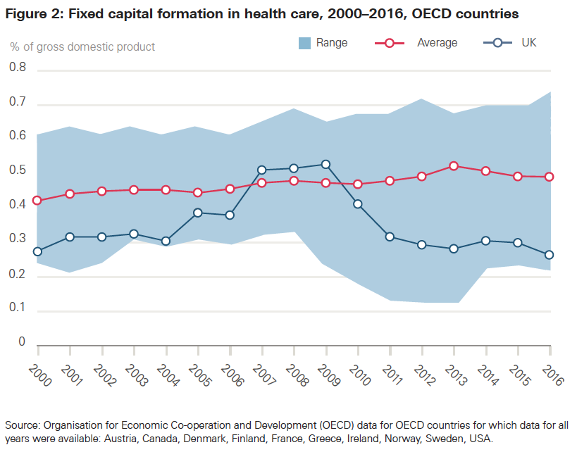
We can compare the NHS to other health systems in how it allocates money to the things that should matter to future productivity. The easiest to measure is capital spending. And, mirroring the problem with spending in the economy as a whole, the big picture looks to be a catastrophe of poor short term choices (for a more detailed analysis see my longer rant here). In an analysis in 2019, the Health Foundation produced this chart:


And said:


"Capital spending is a critical input in health care, with new technology able to transform services and improve workforce productivity. 


The DHSC has proposed a more technology–and data–driven NHS. New technology and IT could improve patient services and increase productivity, but both currently make up a small proportion of capital spending."


So, not only does the NHS get starved of capital spending in general but the mix is very light on the things that would typically have the biggest impact on productivity.


The result of this is that the capital employed per worker (an interesting measure of the stock of things that partly determine productivity) is half that of most comparable systems. 


And, according to the National Audit Office, even when the NHS gets allocated a capital budget, it frequently either underspends it or pilfers it in year to cover operating deficits. This is a perfect illustration of the political choice to take an easy path rather than the right one. And one that has, in effect, killed the hope that NHS productivity could improve enough to lower the financial burden on long term government spending. And this has been the chosen path for two decades. It is little wonder that the productivity of the NHS is falling and that the system is creaking under the strain. 


Some conservative commentators are now arguing that the government can no longer afford to keep spending more, as they need to do to stop the wheels from coming off the bus. But those commentators ignore a major  reason for the current need for more spending: the neglect of any attempt to spend the money on the long term things that would make the NHS much more productive and reduce the pressure to spend more to avoid imminent catastrophe. 


And the opposition don't help pull the debate back to solid ground by claiming everything is about staff shortages. There are two problems with this. One is that investment in better equipment and facilities could improve productivity so much the need for more staff could be reduced. The other is that the biggest reason staffing is a problem is not recruitment, it is retention and a large part of that is caused by the poor working environment some of which is caused by the lack of capital per worker. And the constant churn of staff, especially when experienced staff are replaced by cheaper but less capable staff, undermines team productivity and quality, exacerbating the need for yet more staff in some sort of anti-productivity death spiral.


So what?

And this brings us back to why the NHS is a microcosm of the economy as a whole. In order to attempt a rescue of government finances ravaged by the Kwarteng mini-budget, the key proposals to recover the government deficit currently being discussed are to cut things that are easy to cut quickly. Like capital spending. So, instead of spending on the long term things that enhance future productivity, they are likely to cut them further and in ways that damage the very growth they seek. They should have learned from the Osbourne era that that does not work. The easy path then–capital austerity–hurt the national growth rate and made it harder to fund the sorts of spending the government cannot cut if they don't want to lose their core voters (are they going to cut pensions when the most conservative block of voters are pensioners? I don't think so).


As Martin Wolf said in a recent column in the FT (my highlights):


The UK’s longer-term economic performance must indeed improve if the desires of its people for a better life are to be realised. If the government wants to do something useful about this, it might dust off the report of the London School of Economics’ Growth Commission of 2017. Better incentives are indeed a part of the answer, but only a part. This is why systematic tax reform would be desirable. There must also be difficult deregulation, notably of land use. The state must supply first-class public goods, in the understanding that these are a social benefit, not a cost. There must be fiscal and monetary stability. There must be far higher investment in physical and human capital, both public and private.


Neither the economy nor the NHS will be better tomorrow if the investment in the long term is cut. The persistent habit of picking easy cuts rather than the right cuts is a recipe for long term catastrophe (and possibly short term catastrophe too). 


Spending the money well (especially not neglecting long term investment) is the solution to the growth and productivity problem in the NHS and the wider economy. Spending it badly by making easy choices now is not.


PS that cartoon is modified from an original by the late great B Kliban. See some of his other quirky cartoons here: https://www.gocomics.com/kliban