The problem with the statistics on A&E performance goes far deeper than worries about fiddling the data to get better reported numbers. The real problem is the conflict between the political need to report the best performance and the management need to know what is happening so they can improve performance. The two are in serious conflict in a way the system has never fully acknowledged.
The political desire is report something, preferably something good. The management need is to report something useful for directing management attention to actions that will lead to improvement.
The conflict arises because essentially all the performance problems are in major A&E departments so reporting a combined number (including minor units) distracts attention from the units where performance is worst. For management purposes we might as well ignore all the stand-alone WICs and MIUs as they almost never see waits longer than 4hr. We should report their performance, but we should report it separately to avoid confusion about where the problem is.
The political argument is that emergency care is a system and we should report the overall performance of the system. But this is based on a fallacy. Originally, MIUs and WICs were intended to relieve "pressure" on major A&Es who would, as a result, show better performance. This failed for two reasons: one was that there was no evidence that they diverted a notable number of patients away from major A&Es; the other insight (only available after better data was collected from everyone) is that, even if they had succeeded in diverting patients from major departments, this would not have improved performance in the major A&Es (the divert-able patients are not the ones with long waits even in major A&Es).
What this means is that there are really two systems out there not one: major A&Es (type 1 departments) and units handling minor conditions (type 3s). They don't interact enough to be considered a single system. So they shouldn't be measured as a single system because that just creates confusion about where the problems are.
(There is a slight grey area where a type 3 unit is closely associated with a major A&E. In many of these all the minors are diverted at the front door to the type 3 unit. But this is exactly how a well functioning type 1 A&E should behave internally anyway (minors should be streamed to a simple and fast process) so it seems a little odd to separate the two for reporting purposes. This only applies when the units are co-located.)
The big conflict comes when hospitals are allowed to count remote WICs and MIUs in their headline performance. The only benefit of doing this is political: it makes the overall number look better. It causes immense confusion and inconsistency in headline performance, not least because some hospitals can do it and others can't making any performance comparisons unfair. Worse, some hospitals have wasted large amounts of management time trying to grab control of minor units so their headline numbers improve, a change which makes precisely no difference to any patient's experience but wastes a lot of management resource in pursuit of window-dressing not actual improvement.
It is unclear what the recent changes mean to all this. In the current reports it is normally possible to extract pure type 1 performance if you want to see it (though it isn't the headline number reported). If the new rules allow less transparent reporting of numbers from minor units they are clearly obfuscatory and bad for the system.
David Nicholson (the former head honcho of NHSE) doesn't agree. He claimed in this tweet that the 95% target was a system target, was was correctly set at 95% and would have been set much lower if it was intended to cover type 1 performance only. But he needs a history lesson. The original target was set at 98% and was only reduced to 95% when the incoming coalition government realised that abolishing the target completely would be a catastrophe. And there was no convincing clinical argument for the change (the original 98% was to allow for a small number of clinical exceptions–concussions, for example–where patients needed to be observed for more than 4hr before discharge). Yes, some medics thought the target was too strict, but they had no evidence-based clinical reasons for this: they believed, naively, that a more relaxed target would be "easier" to meet. They were wrong: before the target was changed the system was exceeding it; as soon as it was changed performance declined rapidly and frequently failed even to meet the new–supposedly easier–target.
It is also worth noting how the system performed when the original target was set. I extracted the chart below from my archives (I provided the internal weekly reports of national performance to the A&E team for several years after the target was first set: the chart comes from a public presentation I did; sadly I don't have access to the detailed data any more).
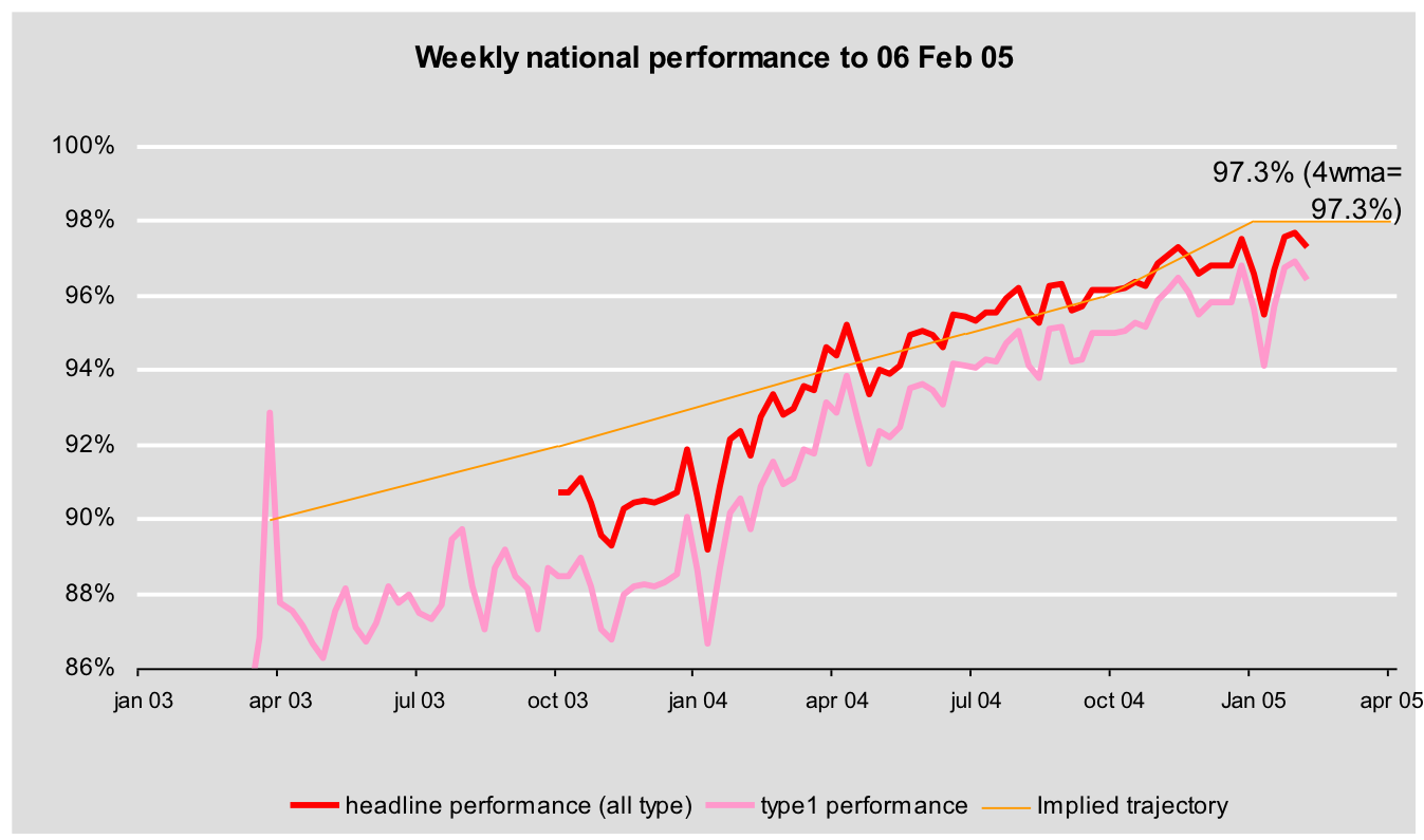
The system as a whole eventually met the 98% target for several years. And the type 1 performance often met the 98% until 2010. Moreover, the dilution effect of including the non-type 1 units was small when the type 1 performance was good. It is also worth noting that the decision to publish the system performance (including non-major A&Es) was challenged by analysts who knew that the focus needed to be on major A&E departments. The politically-minded civil servants disagreed and decided to publish the system performance but compromised by including the type 1 performance separately in internal reports to support more focussed improvement interventions.
While consistency is a good thing to aim for (this is the excuse for the changing rules) we seem to be aiming for a fake consistency. WICs and MIUS are not evenly distributed so consistent aggregation of numbers creates an inconsistent and unfair view of actual major A&E performance in different hospitals. By far the easier way to achieve real consistency would be to focus on major A&Es only and ignore the rest (or report their performance separately). That would be consistent and fair. But performance would look much worse.
The same is true for other, related, statistics on A&E performance. England also publishes a 12hr wait statistic, but this is incredibly misleading because it isn't an end-to-end metric. The clock starts when the hospital makes a decision to admit the patient, which many don't make until they know a bed is free meaning that the patient may already have waited 12hr before the clock even starts. Wales and Scotland start the clock when the patient arrives, which isn't gameable. This has confused the Prime Minister who incorrectly compared Welsh and English numbers during PMQs, drawing criticism from the chair of the UK Statistics authority, not least because there are about 100 times more end-to-end 12hr waits in England than the published number quoted by the PM suggested (as I explained here).
Real 12hr waits are actually measured in England just not published. NHS Digital now release them (but infrequently) and few NHS managers seem to know they exist or use them despite the important additional information they provide supplementing the reported 4hr performance. They are very embarrassing as they highlight just how badly A&E performance has deteriorated in the last 8 years. So embarrassing that I was once fired for impetuously talking about them in public (I shouldn't have done but I was naively trying to improve the quality of the debate about A&E performance using actual data).
To summarise. The real problem isn't fiddling the numbers: it is choosing the wrong numbers to look at in the first place. The need to improve performance is in conflict with the political need to report the best performance possible. We should report the numbers most useful for driving improvement (type 1 4hr and 12hr performance) not the ones that confuse us about where the problems are.
PS when private sector firms do this with their performance numbers it usually ends up in disaster. Enron and Carillion, for example, used clever ruses to make their public headline financials look better than their real underlying performance. In the end their managements fooled themselves. Eventually, the real situation became apparent, but far too late for anyone act to avert disaster.
Strong!
ReplyDelete