Pages

Tuesday, 25 April 2017

Wrangling English prescribing data

This is a technical post intended to remind me of what has to be done to make sense of English prescribing data, an amazingly useful open dataset that summarises everything dispensed in the community in England (which accounts for about £8bn or about 8% of NHS spending every year). For all its usefulness, it is a pain to do analysis with it for a variety of reasons. I hope that by describing how to make sense of it my notes will also be helpful to others. I may update this as I work further with the data.

Introduction


The trouble with english prescribing data is that, although it has been openly available since 2010 (every month we can see exactly how many prescriptions of each type are dispensed in the community) it isn't easy to make sense of it.


The raw data released by NHS Digital consists mainly of a file detailing the BNF code (a 15 character code describing the exact item being prescribed, BNF is the British National Formulary), the GP or clinic code for the issuer of the prescription, and the amount of things prescribed (by book price, actual cost after discounts and charges, number of pills/volume/units). What it doesn't have is the sort of metadata that helps you group these things together into useful categories (GPs mapping to CCGs or the grouping of drugs into categories).


The BNF code does contain useful information to solve some of that problem and there are lookups for the mapping of GPs onto bigger units. But these have to be downloaded from other sites and the extra data doesn't always map neatly onto the raw data. This blog describes how I sort, wrangle and combine the sources to make something more useable partially to help me remember and also so others can see roughly what is required if they want to play with the data.


BNF codes


BNF codes actually contain a hierarchical coding that groups drugs and devices into categories. The codes group drugs into chapters, sections, paragraphs and subparagraphs. Chapters are mostly about what sort of problem the drug deals with. For example, there are chapters for drugs treating the digestive system, drugs treating infections and devices for incontinence. The other levels group these together in a fairly reasonable hierarchical classification. It works like this:
  • Characters 1-2 code the chapter
  • Characters 1-4 code the section
  • Characters 1-6 code the paragraph
  • Characters 1-7 code the subparagraph
  • Characters 1-9 code the chemical or device
  • Characters 1-11 code  the product (often essentially the same as the chemical)
  • The remaining characters code the specific item (different versions of the item, different formulations of the same drug, different strengths of pill, etc.)


There are some complications on top of this, though. Dressings and appliances only have 11 characters in their codes (though the raw data makes all codes 15 characters long by right-filling the codes with blank spaces, some metadata sources use a mix of 11 and 15-character codes just to be really annoying).


So, while we can derive a hierarchy from the raw data, we need to find a source for the names of chapters, sections, paragraphs and so on (the raw data comes with a file describing the names of each specific item's formulation). We could just buy the latest BNF (available in book form with all sorts of useful advice about drug use, safety and dosage and updated every six months). But the book is over 1,000 pages long and there are nearly 40,000 items to code so it isn't a very practical way to get the metadata unless you are both a masochist and a good typist.


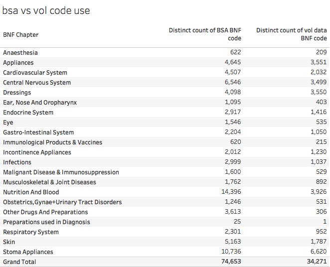
Annoyingly the BNF doesn't, as far as I can tell, release an electronic form of the data (even their iOS app requires an Athens login presumably in a futile attempt to prevent non-qualified people misusing the data even though those who want to can just buy the physical book). But the BSA (the NHS Business Services Authority, who compiles the data from the raw prescriptions used to pay pharmacists), does. It is accessible as described in this useful opendata.stackexchange post. But the BSA have a deserved reputation for being annoying awkward bastards when it comes to open data. The opposed making the raw data available as opendata when Tim Kelsey originally proposed the idea. Their own tools for accessing the data are clunky, slow and primitive. And they don't fall over themselves to make anyone else's life easier. For example, their metadata is coded using both 15 character and 11-character BNF codes (unlike the raw data which pad all codes to 15-characters long). Worse, the lookups are inconsistent from year to year (the 2016 release has 35,673 BNF codes but the 2017 release has 74,653 even though the entire public dataset doesn't have that many unique codes in it). Worse still, not every code in the public data has a matching code in the metadata file.


It is unclear why there are so many more codes in the latest BSA metadata. Here is how this looks compared to the number of codes actually used in the raw volume data:


And this understates the scale of the problem as some of the codes in use don't match anything in the metadata. This table shows that problem:
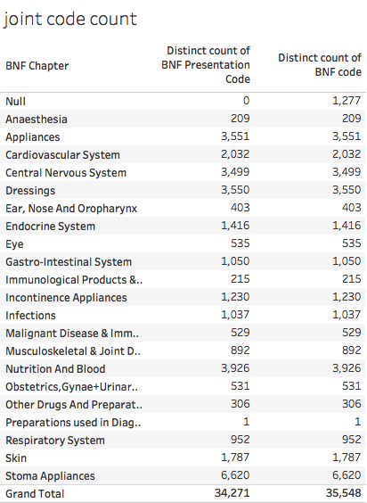


This table shows that 1,277 codes in the raw data are not present in the 2017 metadata at all.


This is pretty fucking annoying for those of us who want to do analysis.


All is not lost. The correct position  in the hierarchy can be retrieved for the things actually prescribed as their codes contain some of the information about their position in the hierarchy (remember the BNF code contains the chapter, paragraph etc. codes).


So we can highlight the 1,277 missing BNF codes by doing some SQL magic in BigQuery:


Screen Shot 2017-03-28 at 18.22.45.png
And then we can reapply the known chapter, section etc. values, where they exist. Unfortunately, they don't always exist because the BNF sometimes revise the hierarchy, adding new ways to classify drugs. The biggest change recently was the introduction of a new paragraph and subparagraph classification for drugs used in substance abuse. This replaced the codes of drugs with new codes but means that the old codes won't fit correctly into the new classification. This can be fixed manually, though it is a pain in the arse to do so.


In addition, the raw data files containing metadata for chemical/product names uses a different structure for the chemical codes for the chapters consisting mostly of devices and dressings (all chapters>19). Instead of a 9-digit code the product/chemical is described by a 4-character code (ie the same as the paragraph code).


But, despite these difficulties, I persisted anyway. I extracted the codes actually used in the raw data and filled in (to the best of my ability) the missing hierarchy parts so that I could produce (nearly) complete classifications of everything actually prescribed.


Prescriber Locations


Then we have the problem of knowing who prescribed and where they are geographically. The raw data contains the prescriber code (some clinics but mostly the standard code for GP Practices). It also contains fields described as SHA and PCT.


Unfortunately the NHS has been reorganised since the data was first published and both Strategic Health Authorities (SHAs) and Primary Care Trusts (PCTs) were abolished and replaced by NHSE Area Teams (NHSats or some acronym like that) and Clinical Commissioning Groups (CCGs). The data in the SHA and CCG columns switches to new codes somewhere in the middle of the timeseries. This is sensible, but has the major disadvantage that the raw codes don't allow a consistent set of regional comparisons over time even though the actual people doing the prescribing are the mostly same (neglecting the small number of closed and new GP Practices). Another problem is that the fields contain codes that are not regional or local bodies. Some look like the codes of hospital trusts; sometime SHA codes appear in the PCT field and sometimes codes are used that don't appear to match anything I recognise.


There are two ways round this problem. One is to use the geography of postcode locations to map the locations of practices onto the area where the postcode is located. The ONS produces lookup tables showing the higher-level geographies each of the ~2.5m postcodes in the UK resides in. This won't always match the actual NHS administrative hierarchy for GPs, but is is close and we can extract the relevant NHS codes from a single lookup table, the ONSPD table which is large but manageable and downloadable from the ONS Geography portal.


The alternative is to match GPs to CCGs using the lookup tables NHSE are supposed to provide. This should be exact, but the tables are not always up to date and some codes were altered after the original release (presumably just to make life harder for analysts like me). And CCG membership and boundaries have changed several times due to GP defections, and CCG mergers/splits. Since doing consistent geographic analysis is clearly a waste of time for everyone, why should I expect this to be made easy for me?


Even if we use the NHS GP to CCG lookups, we still need the ONSPD file to identify the precise location of practices. This file, at least in recent versions, give the lat/lon of every postcode so enabling location maps with little fuss if your choice of analysis software can map using lat/lon (I use Tableau which can draw a map as soon as you give it a lat/lon).


Back to the raw data which has some further traps for the unwary. Alongside each month's prescribing data,  NHS Digital release a file containing the lookup from prescriber code to prescriber name and full address. WOOT! You might think, problem solved. Unfortunately not completely as there are some consistency problems. For each practice code there are a practice name and 4 address fields in the data. The last two address fields should contain town and area, but often don't. Sometimes the last field is town; sometimes it is blank; sometimes the town fields contains a third address. Luckily we rarely need those full addresses so we don't need to fix these inconsistencies. But we do need the postcodes and they are, at least, all in the same column of the data.


But not in a consistent format for fucks sake. There are several possible standard ways of formatting postcodes (the ONSPD file has three alternatives in case your data uses a different one). This happens because postcodes have different numbers of characters (for example, B1 7PS; BT6 1PA; SG18 2AA; SW1W 9SR). You can force fit all postcodes to 7 characters (some will now have no spaces), 8 characters (some will have multiple spaces) or a variable length which always has just one space in the middle. The raw data for prescriptions is supposed to be in the variable length format. And it often is, but not always. In some months some of the postcodes have an extra trailing space which means that any lookup to location using the ONSPD file fails. It is easy to fix (databases and spreadsheets have TRIM functions to remove redundant space) but why didn't NHS Digital apply this before releasing the damn data. It isn't as if they are even consistent every month.


This isn't the only problem with the postcodes. Some of them are wrong. It is almost impossible to tell this unless you draw maps and observe locations over time (I do which is why I spotted the problem). Some practices change postcode over time in ways that don't make sense. Sure, some practices move location to new buildings and get a new postcode. But in the data some make leaps of hundreds of miles and then move back. On investigation, some codes have been transposed from practices near them in the list in some months. This isn't common, but suggests that some analyst has been making transposition errors when putting the data together and hasn't found a reliable way to validate the whole monthly dataset.


Putting it all together


Now we have a (mostly) complete way to classify drugs we can look at the whole hierarchy. A summary is given below:
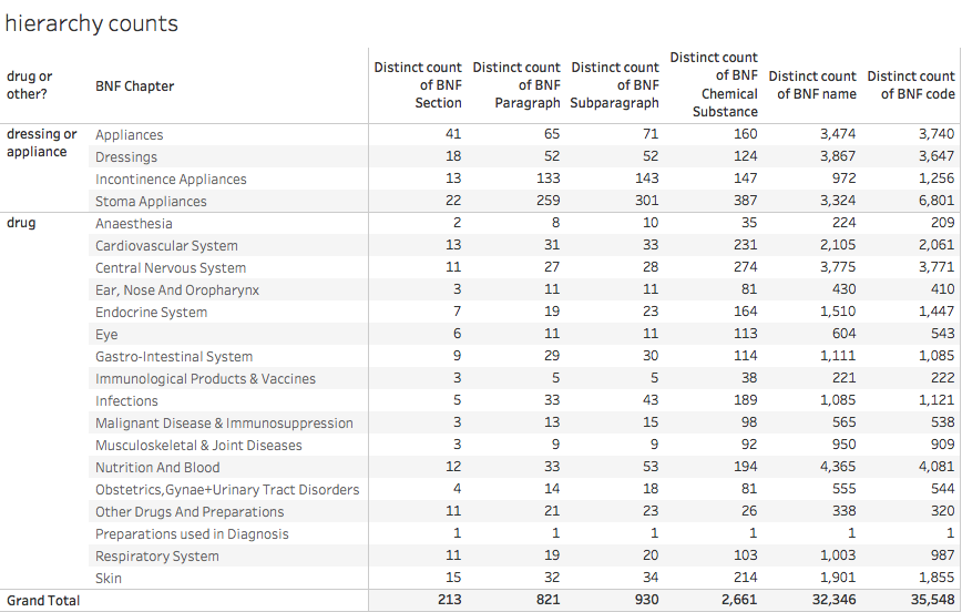

hierarchy counts to dec 2016.png


Note that the number of distinct names doesn't entirely correspond to the number of distinct codes. This is because of several factors: sometimes the name is changed over time for exactly the same product; sometimes the hierarchy is reorganised giving existing drugs a new BNF code (for the same exact product) and a variety of other reasons.


Normalising the results


Sometimes we need to know more than just the total amount prescribed. When we want to compare GP Practices, for example, we need to account for the fact that GP lists have a wide range of sizes and population demographics. A fair comparison of two GPs requires adjustments for both the size and age mix of their populations. The old pop a lot more pills than the young so any comparison needs to adjust for the age mix or it won't be fair.


The simplest normalisation is pills per head which is easily derived from gP Practice List size. A better comparison needs to use the whole demographic profile for the population on the list. Two common schemes are to use units known as ASTRO PUs and STAR PUs. ASTRO PUs take into account the age/sex mix by defining a standardised rate of prescribing by number or spend for different age/sex bands in the population (which is originally based on the English average rate though the actual analysis is only done every few years). STAR PUs are defined for specific categories of drugs where the national rate may be inappropriate.


An ASTRO PU (item or cost) is the cost or number of items that a practice would be expected to incur if it prescribed in exactly the same way as the average practice in England. Per quarter (so you need to adjust the timescale if you are working with units other than quarters). I create a table of monthly ASTRO PUs from the quarterly population data so I divide the values by 3 to get an expected monthly number of units.


But deriving the relevant factors for a Practice is not simple as list sizes change over time. And, as usual, you have to find the data, which isn't trivial. The NHS BSA have some but it only starts in 2014 (our prescribing data starts in mid 2010). NHS Digital have quarterly data from 2013 and, if you search carefully enough, some data from 2011. But no obvious single series going back to before 2013.


And that isn't the only problem with the data. Recent quarters add the useful extra information containing the ONS standard codes for NHS geographies as well as the NHSE codes. But this means the files are now in a different format and must be edited before being combined into a single source. Plus the file names are inconsistent and don't (usually) contain date information so you have to edit that in manually.


To add some anal-probing to the severe beating the poor bloody analyst has already taken, they extend the age bands in 2014 and later data to include 85-89 and 90-95 (previously ended with 85+).


In fact here is a suggestion for how NHS Digital could make everyone else's life easier: copy the Land Registry. They release monthly files of house sale transactions in a consistent format that is easy to join together if you want to create a bigger dataset covering a long time interval. And they also publish a single consolidated (and very large) file that contains all the data they have ever released so you can get a consistent single file with all the data you want with just one download. Or you can do the big download to get started and then update every month from the monthly release without worrying about consistency or manual edits.


Conclusion


The bottom line is that making sense of England's prescribing data is possible, but, at least for parts of the relevant data, unnecessarily hard. The difficulty of deriving joined-up datasets that can be visualised is far, far harder than it should be. It is as if there were a conspiracy to stop open data actually being useful.


NHS Digital could help. They could release the data and all the associated data in a single place where users could use it immediately. They could create repositories that release the data in a single lump rather than in monthly extracts. This wouldn't be easy as CSV files (the result would be far too big compared to the Land Registry where the accumulated file containing all house prices since the mid 1990s is only ~3GB as a single CSV. But there are people would probably do it for free if asked nicely: Google already host bigger public datasets on their BigQuery data warehouse and Exasol have assembled the core parts of the prescribing dataset on a public server for demonstration purposes (see http://www.exasol.com/en/dataviz/ where you can register for access to this and other interesting datasets and many examples of data visualisation based on them). This is the sort of thing that NHS Digital ought to do to encourage the use of their data. Diesseminating it isn't enough.


I should also mention that Ben Goldacre and Anna Powell-Smith have produced an online viewer (https://openprescribing.net) for many aspects of the data but it doesn't (yet) have true freedom to explore any aspect of the data any way you want.

And, not forgetting, my Tableau Public summary of the national data (which leaves out GP-level data to fit into a public worksheet).



Friday, 24 February 2017

There are no magic bullets to cure the NHS. But better diagnosis of its problems and clearer focus on addressing their root causes are a good place to start.

There are a lot of symptoms the NHS is failing. But plans that address the symptoms are not going to fix the root causes of the problems. And a dilution of effort across too many improvement projects will yield little improvement. Accurate diagnosis and ruthless focus on tackling root causes rather than symptoms are essential.

The government knows the NHS has a problem but is confident that current plans can fix it. Campaigners disagree. To some this is a government conspiracy to underfund the systems as a prelude to privatisation; to many of the less conspiracy-minded  the primary problem is just underfunding. But those are not the only things said to be a major cause of the current crisis: not enough GPs, A&E doctors, beds, social care places. Too many patients, old people, worried well patients have also been suggested.

The NHS has a lot of very challenging problems. This, you might think, would be a strong case for very careful focus so the scarce resources available are not diluted so no problem gets enough attention to address it.

When organisations face complicated problem one of the secrets to successfully resolving them is focus. No organisation has enough people, skills or money to tackle every problem and attempting to address too many at once tends to ensure that every effort is so diluted none will succeed. This is an acute problem in the NHS which is very short of people with good problem solving skills and the money required to invest in improvements.

But the only focussed strategies for solving the NHS crisis come from campaigners and lobby groups and they have the disadvantage of being about as credible as a one legged man at an arse kicking contest.

In fact the magic bullets suggested by campaigners get in the way of effective action as they all claim to be the only significant thing that needs to be done, a claim that lacks credibility because it depends more on what they are lobbying for than on any actual analysis of the problem.

Inside the NHS the problem isn't any better. One hospital where I have been working was put into special measures after a bad CQC report. The report is problematic to start with as it is a long list of hundreds of symptoms that things are broken and dysfunctional. The hospital's response is worse: a list of nearly 100 projects designed to address the top symptoms raised by the CQC.

This programme of work is a serious problem itself. The hospital has so little management capacity that tackling just a handful of major projects would be a stretch. And, when the individual projects conflict with each other there is no overriding rationale for deciding which one gets priority.

There is an alternative that would help both this hospital and the NHS as a whole. The alternative is to focus on the handful of underlying problems rather than the scores of symptoms. But this involves developing an understanding of how the whole system fits together and doing the analysis to identify the causes of problems and not just their symptoms. This is both hard and rarely done.

But let's try anyway.

More than half the NHS budget is spent by acute hospitals. And there are many symptoms of failure manifest in current hospital performance. Most are running deficits; many have recently seen the worst A&E performance in decades; elective waiting lists are growing with many breaching the key waiting time targets; many face serious recruitment and staffing problems.

A&E performance attracts many of the headlines. The problem is often blamed on the relentless increase in demand. Hence 15 years of money spent trying to reduce that demand by investing in primary care or in diverting patients to other services. All of which has had no measurable impact on the levels of demand or the performance of the system. Current STPs continue this grand tradition of failure like an unlucky gambler who assumes his next hand will be a winning one. Others blame the problem on a lack of A&E medics or nurses. But staffing has increased faster than demand over the last decade and performance has continued to decline. Yet others blame the many patients who arrive at A&E but could have been treated elsewhere. More focussed analysis notices that this group isn't the one with long waits (that would be patients sick enough to need a bed) or that this group can be treated quickly and cheaply as long as the A&E organises itself effectively to do so (some have put GPs at the front door doing the quick, cheap and simple things that would have happened had they gone to a GP. This is often characterised as "diverting" patients from A&E even though it is actually just organising the work inside the A&E to better match the needs of the patients who arrive).

There is a diagnosis that explains the majority of the observed symptoms in A&E that has the advantage of also explaining problems with waiting lists. It even suggests that many of the other symptoms of acute failure may have the same root cause. The diagnosis is that most hospitals don't organise the flow of patients through their beds in an effective way. When flow is blocked, capacity to treat electives is lower, hitting the waiting list targets and the trust income. Bed occupancy is too high, lowering flexibility, increasing stress on staff, potentially damaging infection control and certainly causing knock-on delays in A&E admissions. When A&E is stuffed with patients waiting for a bed, its flow becomes problematic for even minor injuries leading to a crowded department with a lower capacity to treat patients. And one with a higher workload for staff and a more stressful environment. And, consequently, higher staff turnover and recruitment problems.

In fact problems with beds tie together an incredible number of other symptoms that a hospital is failing. But the problem with flow is rarely addressed as a core problem at all. Instead the symptoms are tackled in a siloed and incoherent way which wastes resources and dissipates motivation when the individual initiatives fail. And the programmes to tackle the symptoms conflict with each other further reducing their chances of success. This is inevitable when there is no coherent vision of the central root cause of the observed symptoms. Which is unfortunate because that is what most NHS plans at every level from STPs to hospital improvement plans look like.

It is not uncommon to have an improvement programme that contains separate projects to deal with A&E recruitment of nurses, A&E recruitment of consultants, staff retention, diverting patients to other services, improving compliance with agreed professional standards, reducing medical outliers in surgical beds and vice versa … all of which would be smaller problems if only the central underlying problem of poor flow were addressed.

Neither individual hospitals nor the small staffs developing STPs have much management capacity to start with. The only way any project will make progress is to focus the available effort on just a handful of goals. And it would help if the goals were based on a very solid understanding of the root causes of the symptoms and not just the symptoms themselves. It is quite possible to devote a great deal of effort, for example, into diverting patients away from A&E (certainly many have tried in the last handful of years) but but this has not worked and wouldn't impact performance even if it did. Wasting resources on doomed wishes is just plain stupid and counterproductive.

If the NHS wants to improve it needs to get better at both diagnosing the root causes of its problems and better at marshalling its resources to focus on those underlying issues. Nothing else matters more.


Sunday, 15 January 2017

Another year, another A&E crisis, but the same dumb solutions

I was going to write another rant on the evidence-free stupidity of much of the current political and media commentary on the current NHS A&E crisis. Then I realised I'd written most of it before during a previous A&E crisis where the same evidence-free solutions were floated by commentators. It seems that our media and political leaders have learned little and still don't bother to check whether their solutions are compatible with the evidence.

So here is a bullet point summary of the things that we know to be true (from analysis of detailed public performance data and patient-level HES data) followed by an edited version of what I wrote in a BMJ response in 2015:

  • It isn't an A&E crisis: that is just the symptom. It is a whole hospital crisis caused by a failure to manage effective, timely flow through beds.
  • The volume of patients turning up at A&E is irrelevant: it isn't about "pressure" on the input side; it is about blockages on the flow from A&E to beds.
  • More resources to A&E won't fix the problem: only solutions that improve flow across the whole hospital will help.

So, if you are still blaming GPs, patients with trivial problems, immigrants etc. you don't understand the problem and your solutions will just waste NHS resources and will deliver no actual benefit.

Anyway here is what I wrote in the BMJ in 2015 in response to a similar fact-free debate.

Yes, stop blaming patients, but start by identifying the root causes of problems


It is really worrying that so many system leaders think that the problem is caused because too many people are coming to A&E and that the solution is to encourage them to go somewhere else. The idea is superficially attractive as an explanation for problems but is clearly wrong for several reasons. Moreover there are no proven ways to drive patients elsewhere.

The data about A&E attendances in major A&E departments (type 1, 24hr, full service A&Es) shows a steady low rate of attendance growth over the last 20 years with no sudden surges (many people confusingly include the numbers from non-24hr minor injury units and walk-in centres which have expanded greatly over this time period without any notable effect on the numbers turning up at major A&Es). Staff numbers have grown faster than attendance.

More significantly, if we analyse the variation in attendance numbers and performance, there is no relationship at all. Higher attendance does not drive poorer performance. This is one of the clearest messages from the data.

Monitor recently published a very comprehensive review of the possible reasons for poor A&E performance ( https://www.gov.uk/government/uploads/system/uploads/attachment_data/fil... ) and concluded that the most significant problem was poor flow through the hospital's beds. This has been well known to experts for some time. In hospitals with poor internal coordination (which is many of them) this problem isn't within the span of control of the A&E department, so blaming the department for poor performance seems particularly unfair.
Why do leaders fail to identify this root cause or tackle it effectively? This seems to be a consequence of a failure to train medics or many managers in the science of how operational processes work. An effective understanding of how processes involving queues work is a significant part of the science Operational Research. And the results are often surprisingly at variance with a naive intuition.

To a naive observer untrained in operational research, it feels like the only reason why a queue is long is because the flow into the queue is high. "Too many people have turned up." The science recognises something more subtle. The speed that a queue is processed is usually far more important than the number of people joining it. And, importantly, the length of the queue will grow very quickly if the processing speed gets slightly slower even if the numbers joining the queue don't change at all. In A&E departments this means the crowding and the overall delay for patients is highly sensitive to the speed of the whole process (of which treatment and assessment are not the bottlenecks). So, if it takes a long time to find a bed when a patient needs it (which we know is a very common and significant problem) the number of patients waiting can grow very quickly indeed even if no more patients than normal arrive in the department. If the department becomes crowded, even the patients who don't need a bed get treated more slowly, compounding the problem and making the queue grow even more.

So a naive manager identifies that the department is crowded and assumes that is because too many people have turned up when the real problem is that there is a bottleneck in the process that means patients can't be moved quickly from the A&E department. The manager might argue more staff are required to cope with the extra demand, but, if the problem is finding a bed, more staff will do nothing to make the discharges faster and actually won't help the crowding problem at all.

The consequence of a naive understanding of how queues work and a failure to analyse the data about the key causes of A&E crowding is a large amount of effort and money spent on the wrong problems. Adding staff in A&E won't magic up more free beds; diverting patients (even if we knew any way to do it) won't actually reduce the crowding in A&E.

So let's stop blaming patients. But, more importantly, let's analyse the data to identify the real causes of A&E delays and let's train NHS medics and managers in how operational processes work so they know where to focus their improvement efforts instead of naively wasting time, effort, and money on the wrong problems.

Wednesday, 14 December 2016

The way the NHS measures average bed occupancy doesn't support effective solutions to the shortage of beds


News headlines today (the BBC's on increasing occupancy of beds and The Times on nighttime discharges) reflect a real problem with bed occupancy in NHS hospitals. But the metric on average bed occupancy doesn't measure what it claims to measure and actively distracts from practical solutions that would improve the system.

The NHS has been collecting data about bed occupancy and availability for a very long time. But just because the statistic has been around for a long time doesn't mean it is useful. Sure, it measures something, but whether that something helps the NHS do a better job is highly questionable.

I first came across the metric in the early 2000s when I was working on problems in A&E departments and realised that finding a free bed was one of the biggest barriers to quick treatment. It still is. What I discovered was that the way the metric is measured is about as useless as it is possible for a metric to be. It not only doesn't help solve real problems, it actively drives people to suggest the wrong solutions.

The trouble is that what we need to understand is why beds are hard to find at the particular time of day and day of the week when they are needed. Peak arrivals at A&E, for example, usually occur between 9am and 10am. So the demand for beds for the 1 in 4 patients in A&E who need to be admitted peaks sometime before lunchtime. That's when we need the beds at least for the uncontrolled flow of emergencies. (In principle, hospitals can control the timing of the flow into elective beds though many don't.)

But the bed occupancy metric doesn't tell us about the availability of beds at the point when they are needed. Nor does it tell us about the average occupancy across the day or the week. It tells us about the number occupied on a particular day of the week at midnight. When I first started working for the NHS I expressed astonishment that the statistic was so irrelevant to the real problem of finding beds when you needed them. I was told that such a long standing practice could not be changed.

The reason why the metric is so useless in practice isn't hard to understand. In a typical DGH with 500 beds, each day will see somewhere between 75 and 100 discharges. In many hospitals those discharges typically happen in the afternoon, often late in the afternoon. This doesn't match the demand for beds which is dominated by emergency admissions which peak in the morning. It isn't helpful to know how many beds are free at midnight: we need to know how many are free every hour of every day.

If we focus purely on the published metric the only way to fix a lack of availability is to add more beds and hope discharges don't become any less disciplined (unfortunately there is plenty of evidence that things will get more relaxed and the beds will fill up with patients who should have been discharged more quickly). If we focus on the pattern of arrival and departure across each day we can see better ways to create space for emergencies. I supported the Department of Health to develop a Bed Management Toolkit in 2007 that recommended a focus on doing as many discharges in the morning as possible (this is still part of good practice recommendations now). If a good proportion of the 75-100 patients are discharged in the morning, there will be plenty of free beds for the emergency admissions. If they stay in their beds all day awaiting slow processes to get them out (like prescriptions for take home medication or discharge notes) then the hospital may well find itself running out of free beds early in the afternoon even though it will have free beds later in the day. Patients in A&E will spend a long in an environment that isn't the best place for their care. There is plenty of evidence that small changes in discharge practices can make big differences to bed availability at the times of day when beds are needed.

In the hospitals who do collect real time bed utilisation, this pattern can be seen and managed. Surprisingly, many can't even collect this data and many who can do nothing to ensure that the data is collected reliably. Others do collect it and do nothing with it.

My main point is that the national bed occupancy metric tells us nothing useful about the problems many have finding beds at the time of day when they are needed. Worse, it tends to lead commentators to demand a major increase in bed numbers, which is both unrealistic and could only happen slowly, rather than a focus on the effective management of discharges, which could yield benefits tomorrow at minimal cost. There are hospitals who genuinely need more beds in the medium term, but a failure to manage discharges effectively makes their problem much worse right now.

The NHS could argue that the problem is outside its control because many patients can't be discharged because of a lack of social care capacity. It is true that this is a big and growing problem. But it isn't the biggest problem. Audits of clinical notes of patients currently in beds usually show that between a quarter and a half are fit to leave hospital. And while perhaps a third of those are stuck because of external problems the rest are stuck because the hospital hasn't got its discharge act together. But, what the hell, it is far easier to be able to simply blame others than it is to do the hard work required to redesign processes inside the hospital.

But back to my main point. Average occupancy isn't very much help and the nationally reported metric doesn't even measure average occupancy. Hospitals need to understand real-time occupancy every hour of every day if they are to have any hope of managing the availability of beds at the times of day when beds are needed. Good systems to manage bed occupancy can lead to major improvements in bed occupancy at the points of the day when it matters and, as a direct result, will dramatically reduce long waits in A&E. This involves understanding of the pattern of demand across the day and a disciplined approach to discharges that achieves much better coordination of departures with the pattern of demand.

If the NHS continues to focus on a bad way to measure the wrong thing about beds it won't get the insight it needs to drive real improvement.


Monday, 24 October 2016

NHS problem solving is broken

The NHS has plenty of problems to solve but it often tries to short-circuit effective solutions by not bothering to check whether the problem has been correctly understood or the solution is likely to work. The system's pathological hostility to data makes this worse. As a result the NHS devotes a great deal of effort into futile actions which demoralise staff because they don't work.

I first started working for the NHS in 2002 when the 4hr A&E target was originally set. I helped compile the national performance reports to monitor progress and I designed some of the first analyses that used patient-level data to support improvement in individual departments. I learned a lot about the problem and what solutions were effective.

In those bad old days treatment was often unbearably slow and sometimes unsafe. There were plenty if ideas about why A&E was so often slow and even more ideas about how to speed the typical A&E journey up. Most of them were wrong. I could tell that because I looked at the data.

Some people thought that the target was a bad idea. It grated with the belief in many doctors that the sickest should get the fastest treatment. Many thought it was impossible. But it proved to be very possible and it also proved to be good for patients. Recent evidence has confirmed that long waits kill: speedy A&Es are not just a patient-pleasing idea, they actually save lives.

Nearly a decade and a half later discussions about the latest A&E performance crisis (we are not yet quite as bad as we were before the target was set, but progress towards that ignoble goal is rapid) are still mired in many of the ideas that were shown to be wrong when I collected the first data. Political debate, medical discussions and improvement plans are still full of zombie ideas that some of us already know won't work.

It isn't just A&E. Zombie ideas are more or less an SOP in many strategic plans across the whole NHS.

This is maddeningly frustrating for those of us who are used to applying evidence to improving the system. Why is so much effort going into ideas that won't help?

I've got a theory: the NHS doesn't know how to solve problems. Instead of doing the hard work of diagnosis and testing, it leaps to implement solutions purely on the basis of their superficial attractiveness. It seeks magic bullets. It focusses on symptoms not causes. It fails, repeatedly.

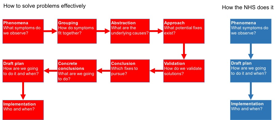
The diagram below sums up part of the problem. It is based on some thinking from one of the few good books on business strategy (which is, after all, a problem solving process): The Mind of the Strategist.

Picture1.jpg

It's author starts from the position of trying to understand why so many business strategies fail and the diagram summarises some of his thinking. The ideas are generic to any type of problem solving which is why they apply so well the the NHS.

Here is my take. The NHS is like a doctor who doesn't want to take the time to really understand what is wrong with her patient and offers palliatives to the superficial symptoms without seeking the underlying causes. Sometimes a headache is just a headache and an aspirin will cure it; other times it is meningitis or a brain tumour and a failure to diagnose correctly kills the patient. Few problems in the current NHS can be cured by the organisational equivalent of an aspirin.

My theory of what is broken explains many strategic and operational failures in the NHS and is the best explanation for why they system as a whole seems to find improvement so hard to sustain.

Dysfunctional thinking leads to poor solutions to problems

My specialist topic is A&E performance and improvement. So I see a lot of misconceptions that frustrate me. Here are some examples.

So people observe that performance is poor. They notice that their A&Es are busy. They leap to the conclusion that they are being overwhelmed by demand. So they propose solutions that are based on diverting patients away from major A&Es.

Or, they note that staff appear overworked and the department is crowded. So they leap to the conclusion that the problem is A&E understaffing (and, perhaps depending on how political they are, they blame this on government underfunding and a national shortage of A&E staff).

But these supposed diagnoses ignore other important observations. There is no relationship at all between A&E attendance and performance either nationally or in individual departments. Mostly, for example, attendance is higher in the summer but performance is worse in the winter. Some of the worst performing departments right now are places where attendance has been steady for several years.

It isn't a staffing problem either. We might have fewer staff than many departments (or the RCEM) would like but we have a lot more than we had 5 years ago (when performance was much better). In fact there are about 50% more A&E consultants than there were 5 years ago and total staffing has grown faster than attendance for some years while performance has continued to decline.

I won't quote the details of this analysis here, but it has been studied a lot. Those studies have had very little influence on the system's choices about strategy or the general discussion on the topic.

The single biggest problem causing poor A&E performance is not even inside the A&E: it is the problem of accessing beds in the hospital. This has been obvious since I first started collecting data about A&E problems. The disease is poor flow through beds. If the treatment is adding more staff in A&E you are merely dealing with the symptom and failing to address the cause of the underlying problem. It's a bit like treating a blocked toilet with some anti-constipation medicine: it's irrelevant and probably makes the problem worse.

Somehow the system keeps coming up with solutions by leaping to conclusions about the symptom and forgetting to do the hard work of identifying the underlying disease. This is exacerbated by a habit of looking only locally and not at the whole system (in a hospital each department looks for its own internal problems but forgets it is part of a system where local initiatives may affect other units and other units may be the cause of its problems).

Big system-wide initiatives seem to suffer from the same problem. When hospital costs are too high the idea of mergers often arises. This seems to be driven by the belief that economies of scale are a major driver so bigger should be cheaper.

There are two problems with this. One is that it doesn't seem to work (few mergers seem to have delivered notable cost savings and many have made things worse). The other is that economies of scale may be all that some economists can imagine, but they seem to only account for about 10% of the differences among hospital costs. But that second observation requires a great deal of analysis and number crunching which isn't much of a part of NHS strategizing.

One thread running through many improvement initiatives is the need to be seen to do something. The NHS would do better to stop doing something until the correct problem has been identified or there will be no energy or resources left to do the right thing.

So what?

The NHS needs to stop leaping to the first solution it thinks of. If the system is to stop wasting the investment it makes in improvement it needs to stop and think.

Look at the whole system not just the local system (so don't assume that problems in A&E, for example, are caused purely in A&E) and group the different symptoms together. And look at the data. We have known since we started collecting data about A&E performance that the overall volume of attendance is not the problem and has no relationship with speed of treatment, but both locally and nationally solutions are still being proposed that involve diverting patients away from A&E.

When you have a picture of how the whole system is performing, develop and test some ideas about what the underlying problem is. For example, many different hospital problems seem from my analysis to be caused by system flow through beds. This idea explains both poor A&E performance and poor ability to reduce elective waiting lists.

What solutions exist? How about actively managing flow across the system? Most hospitals don't even collect the data necessarily to understand how flow works or what actions can make it better. Instead of seeking that data and the understanding and insight that would come with it, most seem to rely on local tinkering (more staff in A&E, extra clinics at the weekend to clear the waiting list backlog). These won't address the underlying blockages in flow through the beds. Worse, some don't try to fix anything relying on assigning blame for the problems on uncontrollable outside factors (which is why there is so much discussion about delayed transfers of care which are a big problem cause by social care, but not the biggest problem as more discharge delays are inside hospital control).

Fixing flow isn't easy, but it is a lot harder if you don't even admit that it is the key problem. Practical solutions (like having the data to know where all patients are all the time) are hard to implement. But doing easy things that don't work is worse than having to experiment with hard things that do. Because repeated failed initiatives sap the energy of staff and waste resources, making doing something different in the future even harder.


The same general observations apply to other problems. The NHS as a whole has to learn that doing the wrong thing because you haven't spent the effort to identify the right problem and the right solution is worse than doing nothing at all.